Rosewood Flip - Before & Afters, with Sources!
SOLD! It's hard to believe that this project is finished! This home, located in East Grand Rapids, had a lot of original charm but needed a complete overhaul. We designed the house striving to embrace the original era of the home, all the while modernizing it and bringing it up to date. This project took about 6 months to complete from purchase to sale. We worked with partners on this home and had an absolute blast. Read more about that here! We were grateful to have accepted an over asking offer, and can't wait for the new family who is going to call this place home!
All sources are linked in the post. Please note that there are a handful of things I could not link, so I linked similar options instead!
Exterior
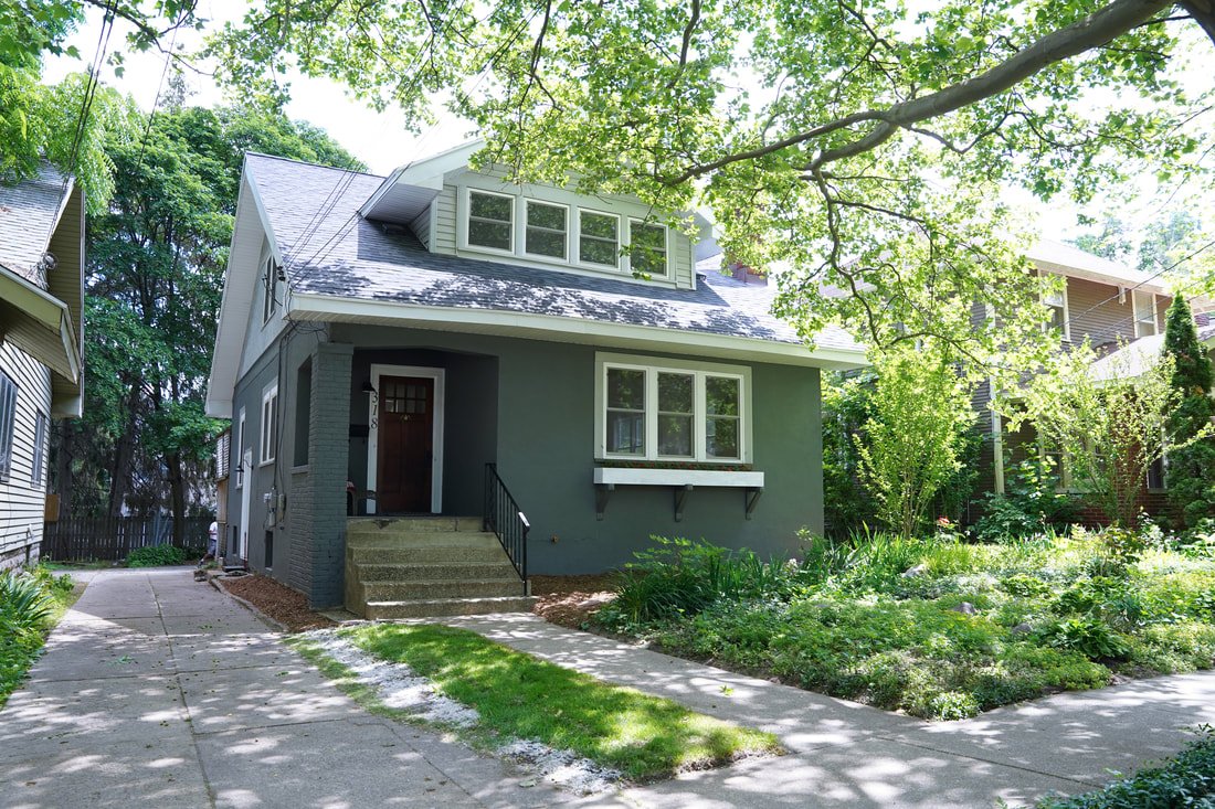
We installed a new roof on the house, restored the original front door, and put a fresh coat of paint on the exterior. The paint color is a custom made color. We could not find one that we loved, so we actually took in a piece of new siding that we liked, and asked the paint store to match. So I cannot provide a color name on this one...my apologies! We built a new window box for flowers to enhance the home's exterior and add a home-y touch. The front yard is full of perennials that several neighbors begged us to keep in place!
Kitchen
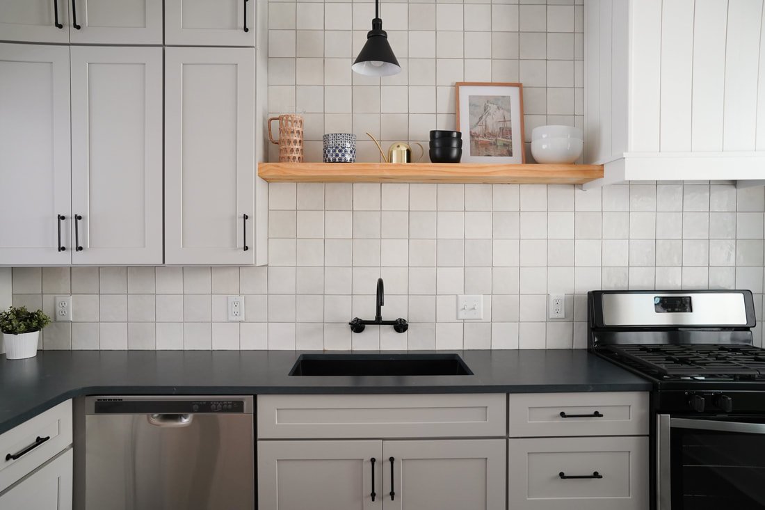
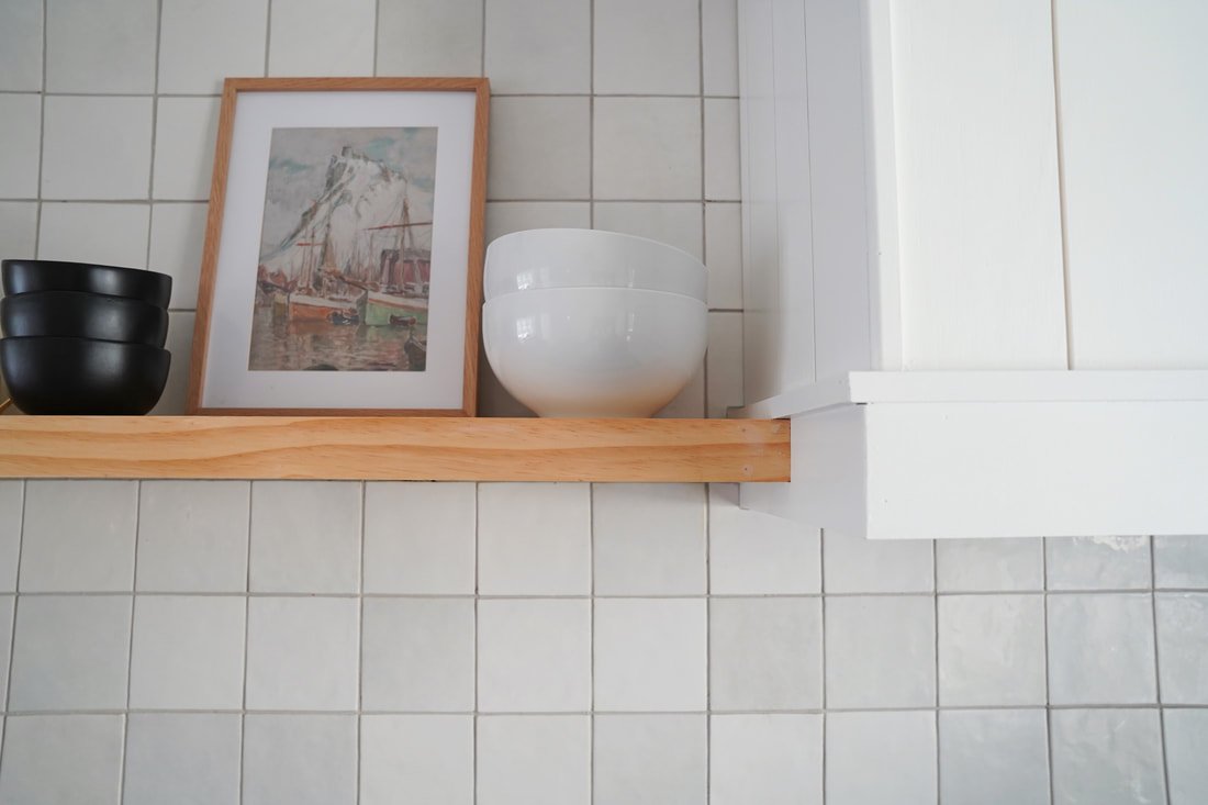
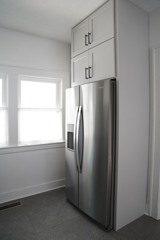
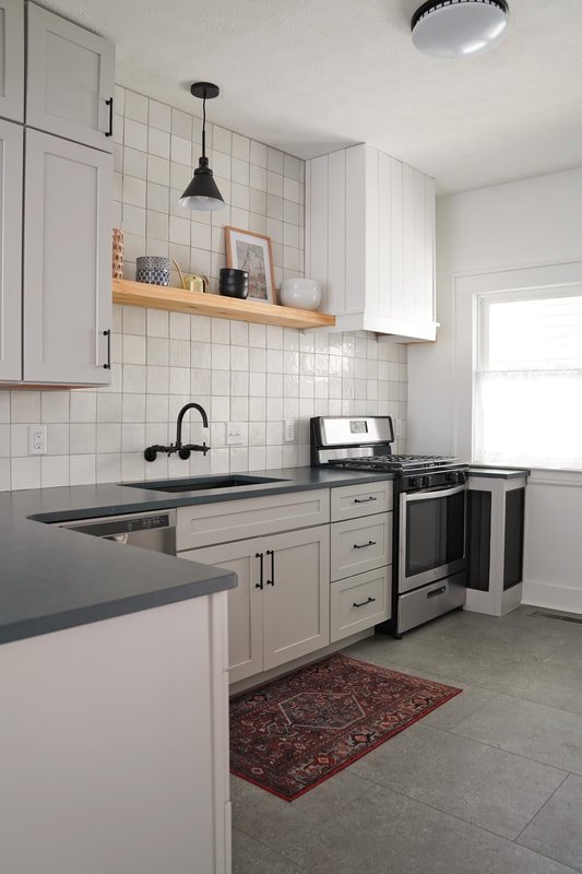
For anyone who has been around here for awhile, you well know that I love to incorporate three things into every kitchen design: windows, open shelving, and a hood vent. Typically, I prefer the sink to be in front of a window, but this was not an option in this space, so we opted to install open shelving (tutorial here) over the sink to make the sink space feel more open. The kitchen is definitely my favorite room in the house! I love how it turned out and will be definitely be using this cabinet color again in the future. We bought the cabinets locally (through Williams Distributing, Smart line color Stone). I always prefer wrapped hoods to stainless...This was our fourth DIY wrapped hood (tutorial here), this time using shiplap to add dimension. The 5x5 tile, with soft gray, beige, and white tones was a fun alternative to the popular brick shape. Tiling to the ceiling added a lot of character and texture to the room and made the kitchen feel high end, as did running the cabinets all the way to the ceiling (which I highly recommend when possible!)
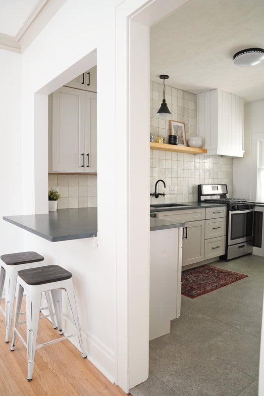
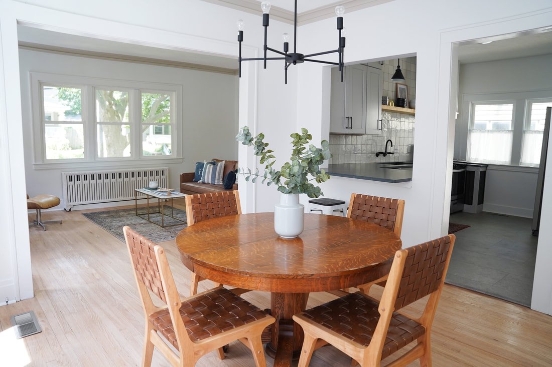
The original kitchen featured a wall mount faucet; we decided to keep that element in tact (and I am definitely team wall mount from now on! I LOVE the way it looks, and also love the idea of not having to clean the counters around a faucet). The biggest change in this room was opening up the wall between the kitchen and dining (which is where the floor ceiling pink cabinets were in the "before" photo). We considered knocking the whole wall down (which would have introduced challenges with the flooring as the original hardwood, which we definitely wanted to salvage, did not run into the kitchen). Instead, we created a "window" between the rooms, completed with a quartz overhang for additional seating. It was the perfect balance that kept the rooms separated (true to the era) while simultaneously creating the illusion of an "open concept."
On Instagram, we got some questions about the space to the right of the range. That is a heat register that could not be moved. Rather than hide the obstacle, we embraced it! We built a cabinet-height box around the register (the black mesh you see allows for air flow), painted it the same color as the cabinets, and installed quartz on top just like the rest of the cabinets. Now, it acts as additional counter space! Score! The countertops are a honed quartz called Charcoal Soapstone Suede by Silestone. Flooring is Coretec Stone Sirius.
Click for more info about Cloe 2.5" x 8" Wall Tile in White Click for more info about KS414MB Concord Bridge Faucet Click for more info about Atencio 1 - Light Single Cone Pendant Click for more info about 64oz Glass Natural Wrap Beverage Pitcher - Opalhouse™ Click for more info about E.Palace Stainless Steel Water Can for Indoor Plants and Garden (Gold 15 oz) Click for more info about Stoneware Cereal Bowl - Hearth & Hand™ with Magnolia Click for more info about Large Indigo Blue Ceramic Storage Bowls Set of 3 Click for more info about Karran Undermount Quartz Single Bowl Kitchen Sink - Black>
Living Room
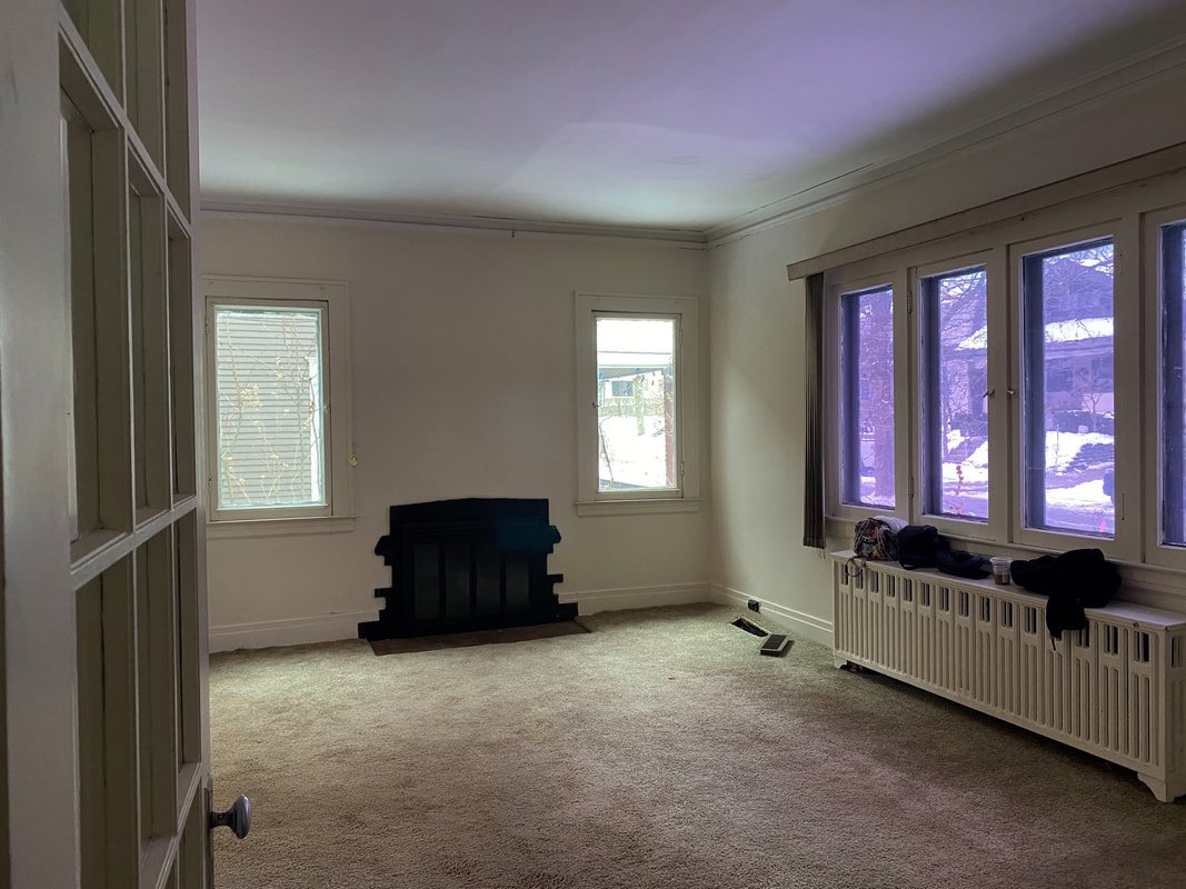
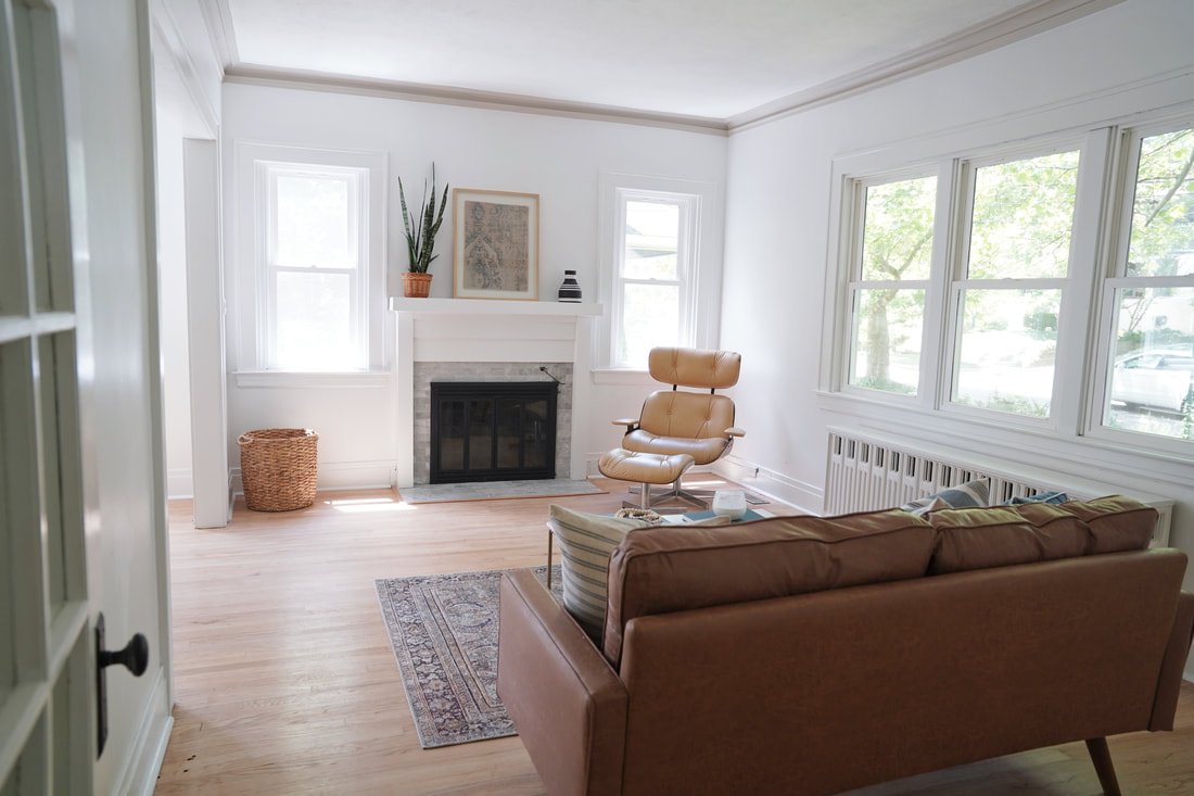
One of the biggest differences in this room is the flooring! We removed the carpet and refinished the original oak. We sanded them down and applied 4 coats of urethane (we did not apply any stain as we wanted the light, natural color). Installing a custom mantle around the fireplace elevated the space, complete with a classic marble surround (again, to match the original era of the home). The entire home was outfitted with new windows. The walls are Sherwin Williams Extra White and the crown molding is Sherwin Williams Accessible Beige. We elected for a pinch of contrast to add another element of visual interest in this main living space.
Click for more info about Giacinto Oriental Olive/Charcoal Area Rug Click for more info about Garzon 69.68" Square Arm Loveseat Click for more info about (Set of 2) 24" x 30" Textured Fabric Framed Wall Art - Threshold™ Click for more info about 1X2 White Carrara Brick Marble Mosaic Tile Click for more info about Delaney 40.5" Rectangular Marble Coffee Table Click for more info about Woven Textured Square Throw Pillow - Threshold™ designed with Studio McGee Click for more info about Aglife Natural Wood Bead Garland Set with Tassels, Farmhouse Beads Prayer Beads Wall Hanging Deco... Click for more info about COVE>
Dining Room
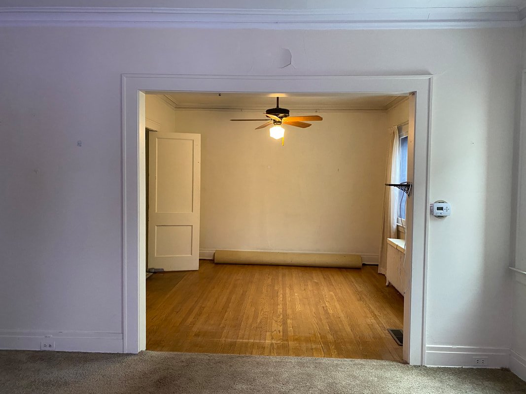
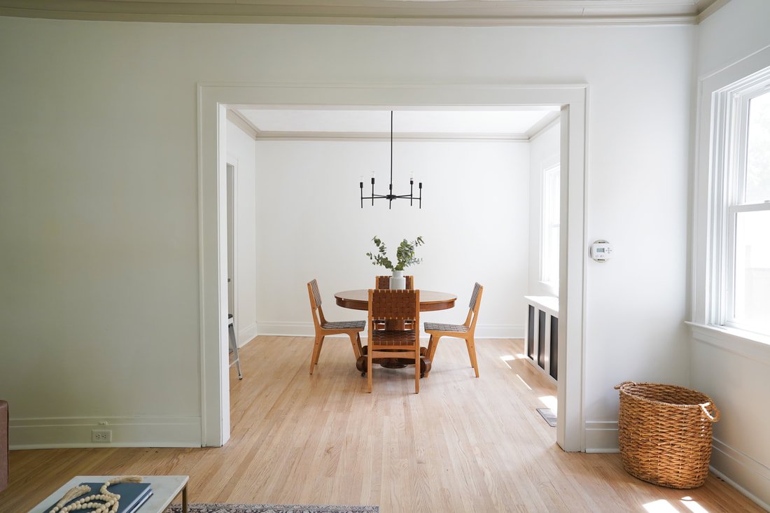
Refinished floors, a revamped heat register, and new lighting made the dining room feel fresh and new. You won't believe that this chandelier is only $69! My mom found the classic oak table thrifting. Isn't it beautiful? In the dining space, the revamped heat register almost acts as a buffet and no longer feels like an obtrusion!
Main Floor Bathroom
Of all the spaces in the house, this room needed the least amount of work! The white 4x4 shower tile was in great condition, so we kept it as is, simply fixing up the caulk. Swapping out the pedestal sink for an adorable wall mount sink saved a lot of valuable space. The new flooring is Coretec Vila color Smoke. Paint is Sherwin Williams Accessible Beige.
Primary Bedroom
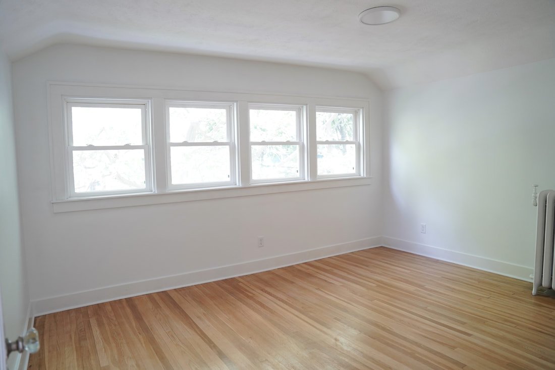
We reconfigured the entire second floor to create a spacious primary with en-suite. See this post for more of the before's. This floor used to consist of an office space at the top of the stairs which lead to two bedrooms; one of which was rather small with a small attached bathroom that was not very functional (see photos below). We decided to close the entrance to the second bedroom (that came from the office). This made the office more functional (with one wall large enough to comfortably fit a desk). We turned that second bedroom into a luxurious primary en-suite with an enormous walk in closet! You'll see the large bathroom below. Behind the bathroom, is a large space that could be used for a fabulous walk-in closet, a nursery, or a second office space. That room is in addition to the two closets that were already existing in the primary bedroom. Talk about storage! The upper floor turned out so lovely that Ty and I were tempted to move in ourselves. (No, seriously!)
Primary Bathroom
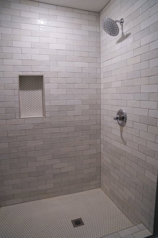
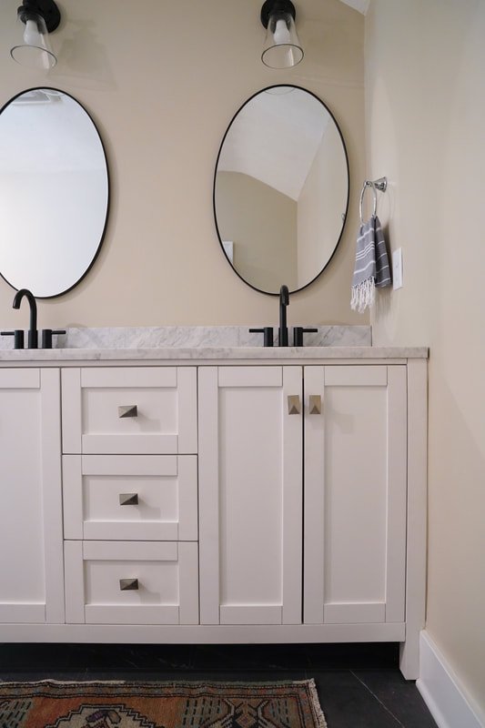
Now here is a pretty radical before and after! I would argue that the new, upper level primary en-suite was one of the best selling points of the home. It was a difficult division to eliminate the fourth bedroom, but ultimately, an expansive en-suite was a better return on investment (especially because the house already had two bonus spaces!)
Flooring is Coretec Vila color Smoke. Tile is linked below the after photos.
Office
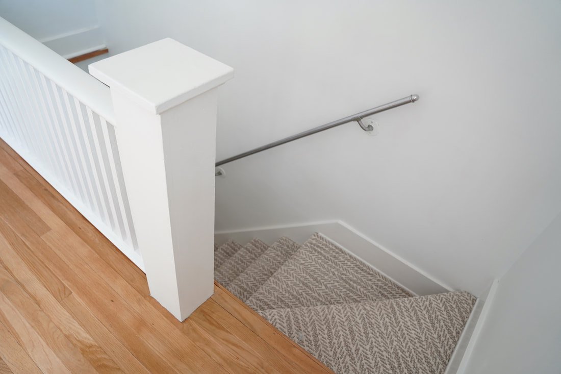
Fresh floors, some drywall work, white paint, and new windows make this a space I could work from! One of the most common questions I got on instagram about the house was the name of the herringbone carpet on the stairs. Stairs are such a fun place to incorporate an unexpected pattern! This carpet is Shaw Lead the Way color Snowfall.
Laundry
I ddi not include photos of the other bedrooms or the majority of the basement (in order to shorten this lengthy post!). I could not help but include the laundry, as the transformation is truly spectacular! Nothing makes doing laundry worse than a scary unfinished basement. Shiplap, vinyl flooring, and new lighting changed this room entirely! How fun is this sheet vinyl? Shaw Ares color Troy.
What a fun ride we had on this renovation! We are so proud of this house and are grateful for the experience...we learn so much with each house! Completing such a large transformation is truly satisfying. It warms my heart to breath new life into old homes! Now, time to de-stage the EGR flip and move onto the next!
In other news, WE CAN'T WAIT TO SHARE OUR NEXT PROJECT!!! It's definitely unlike anything we have done before!!!
Han Jan


