Florida Build Kitchen Design
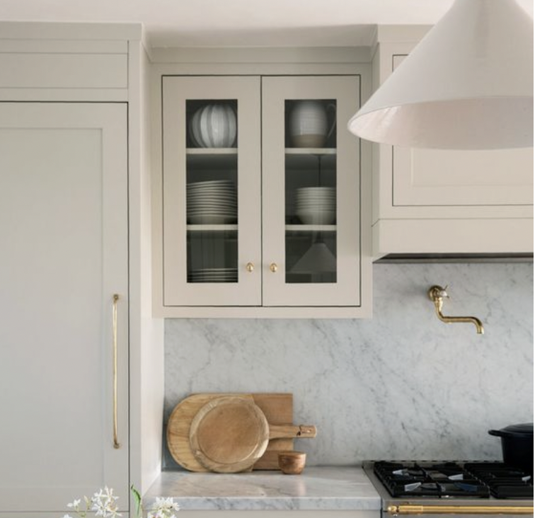
Ah, the kitchen design! I have redesigned this space time and time again, continually tweaking to find the most functional layout. In this kitchen, our objective is to maximize storage while maintaining an open, airy feel. We want this house to feel serene, evoking feelings of a simple beach life. One thing I am doing in this kitchen that I have not done in YEARS (not since our very first home, 7 moves ago!) is upper cabinets! I toyed with many different layouts and kept coming back to uppers near the range. Open shelving felt too cluttered. Towers felt too heavy for the scale of the kitchen. A range alcove would have eliminated too much counter space. Ultimately, upper cabinets fit the bill! Gasp!
Before we dive into the layout, let's talk finishes! Bright, natural, organic...these are the words that we would like to describe our beach kitchen! We're taking inspiration from the streets of nearby Alys Beach, lined with white buildings, lush greenery, and Moroccan influence. Beige cabinets ("Misty Gray" by Wellborn cabinetry) will be used for the perimeter of the kitchen, The island will be white ("Glacier White" by Wellborn). I can't wait to see Taj Mahal quartzite countertops installed! I originally wanted marble but didn't want to worry about renters staining or scratching the real stone. Then, I selected a quartz alternative but never felt quite right about it! Finally, a friend of mine installed Taj Mahal in her home and after seeing the photo, I immediately thought, "that's it!" Quartzite is an extremely strong and durable stone...the beauty of marble but the durability of quartz. Easy YES! Taj Mahal is a beautiful earthy tone. The veining is somehow both subtle and dramatic.
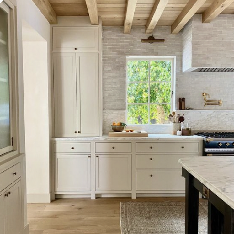
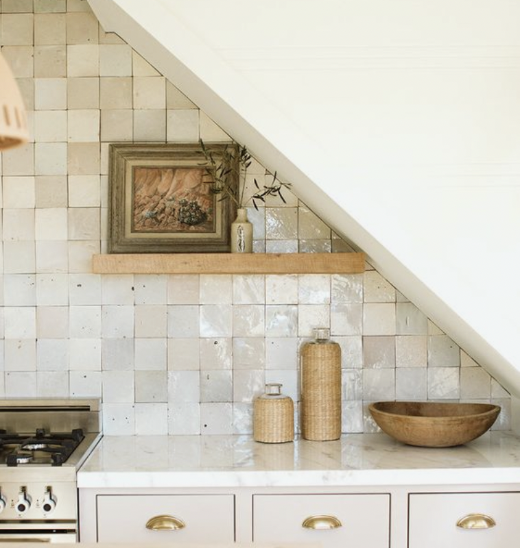
Zellige tile (which we have in our kitchen in Michigan) will add age and character to the kitchen. I love the way the light reflects off zellige! We will be going with this 2x6 brick. Originally, I was planning to install in a standard brick joint pattern but just switched to vertical straight stack. I feel like brick joint would be too traditional for the space, whereas vertical straight set feels a little more casual. Tile will be installed all the way to the ceiling above the sink. The wall parallel to the sink will have tongue and groove paneling, as will the adjacent dining room which will have built in seating. Below are some images of kitchens that I have been loving!
This pendant screams "refined beach" which is exactly what we are going for! After hunting for appliances, we landed on Bertazzoni. I can't wait to cook on this range! The dishwasher and fridge will be disguised behind cabinetry. A vintage runner by the sink and pillows on the built in bench will add texture.
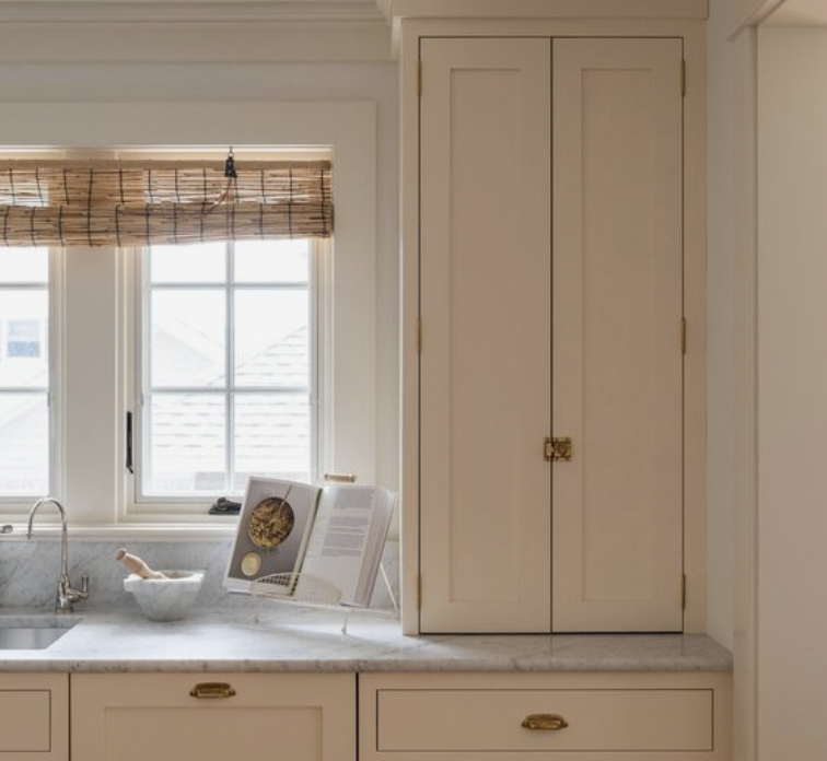
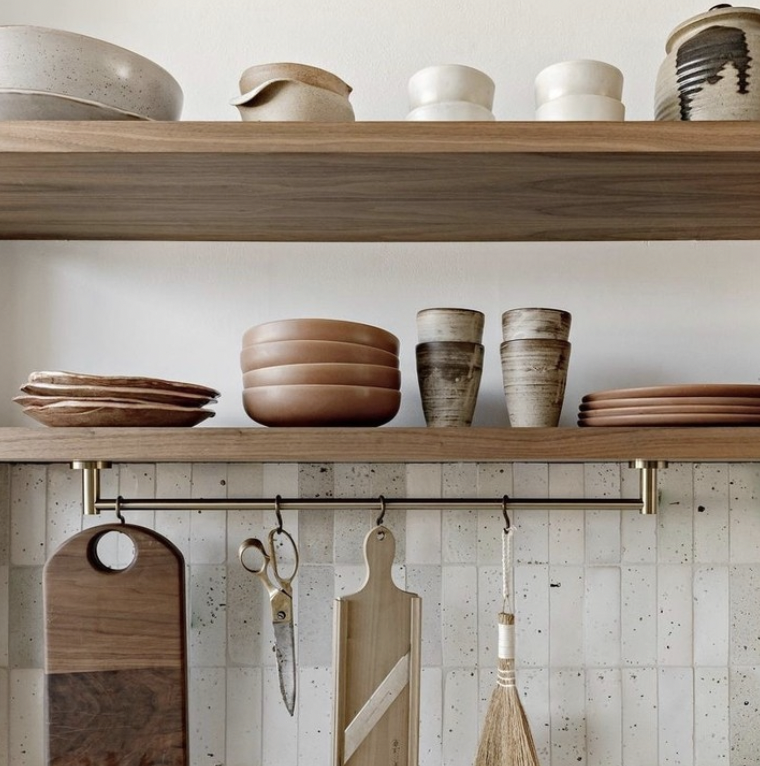
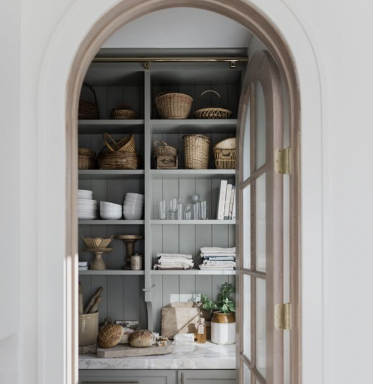
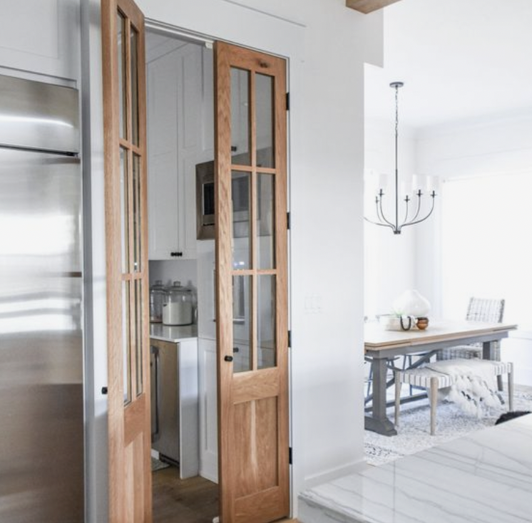
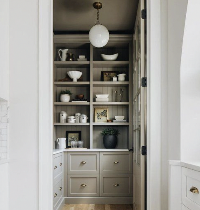
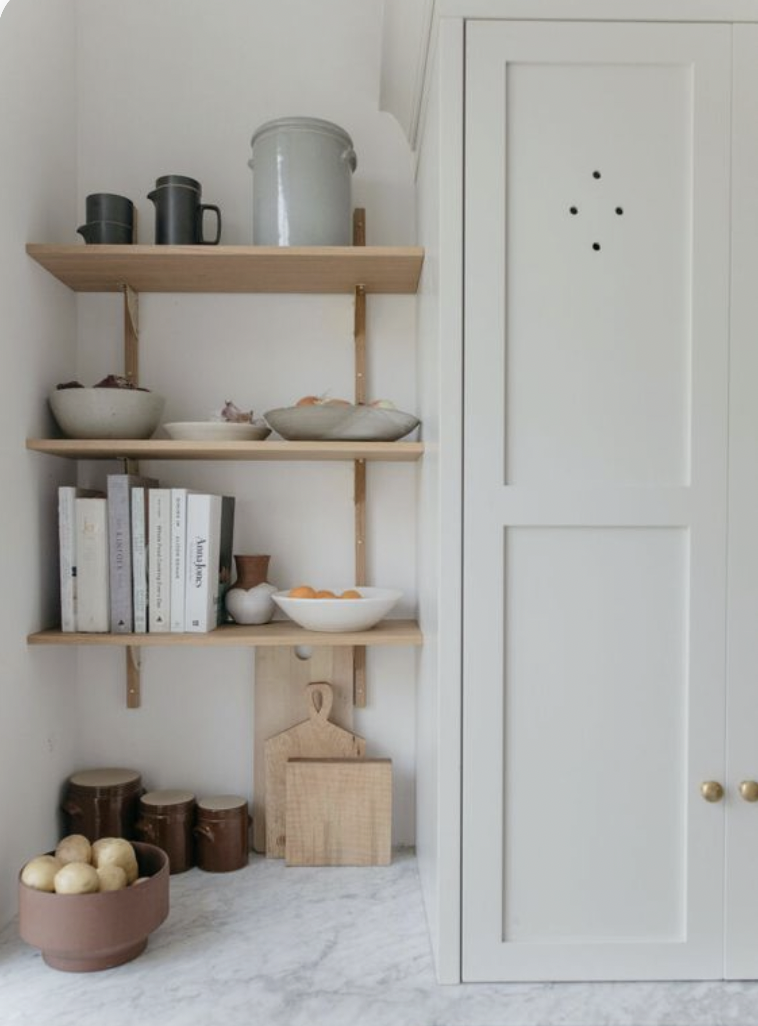
I'm in love with this brass bridge faucet and will be hunting for hardware to match! Lastly, I am probably most excited for the butler's pantry under the fridge. The space had been utilized as a storage closet in the original plans. I asked if we could install base cabinets, open shelving, and tile to create a pantry and our builder loved the idea! Skinny oak French doors will allow natural light to flood the little pantry! I am contemplating this zellige pattern (which coordinates with the kitchen backsplash) to be installed from counter to ceiling, behind the shelving, which will add a whole lot of high design into the small space! Here are some photos that are inspiring our pantry!
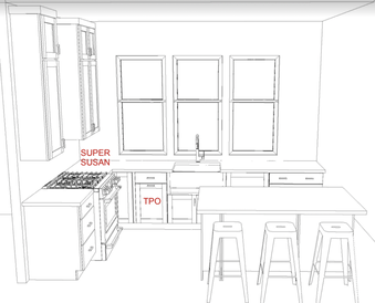
And now for the layout....as I mentioned, we want an open space but lots of storage! Originally, I designed the layout below but with towers on either side of the window and no uppers on the range wall. After some thought, the towers felt too narrow relative to their height (ceiling is almost 10'). Plus, the left tower door would be close to hitting the hood and it felt unnatural. Next, I considered towers on either side of the range with a little quartzite "shelf" between them that would run under the hood. This took away too much valuable counter space near the range where much of the cooking will be done!
Sink + Range Wall
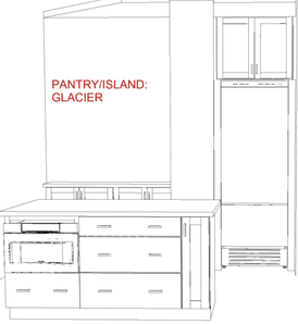
Fridge + Pantry Wall (Pantry will be hidden behind French doors)
Of course, I considered open shelving by the hood but simply wasn't liking the thought of all of the clutter. The main floor is open concept; with the kitchen, dining, and living rooms connected. I have done open shelving in many homes we have built/renovated and have learned that I like exposed shelving most when the layout is slightly more segmented and less open. When we have done open shelving in open concept layouts, I found myself distracted by all of the "stuff." Keeping this beach house minimal and clean will help create that feeling of "serenity" that we area after. Plus, there will be a view of the pretty pantry shelving through the glass French doors (which will go to the left of the fridge in the sketch above).
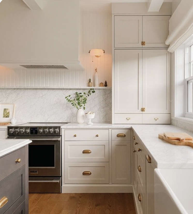
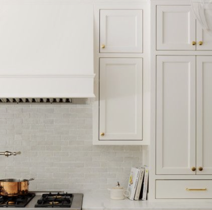
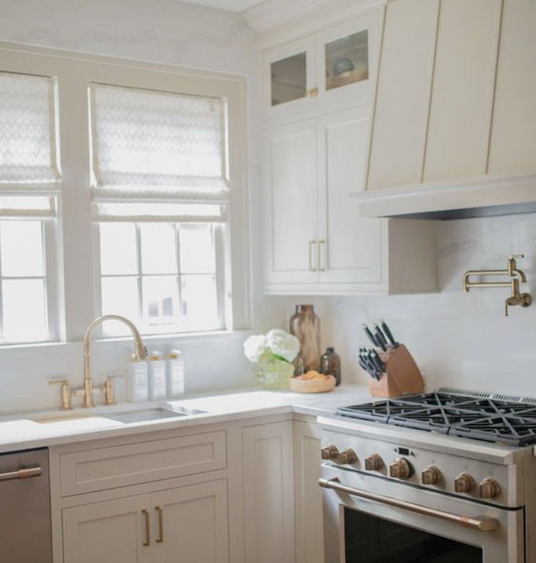
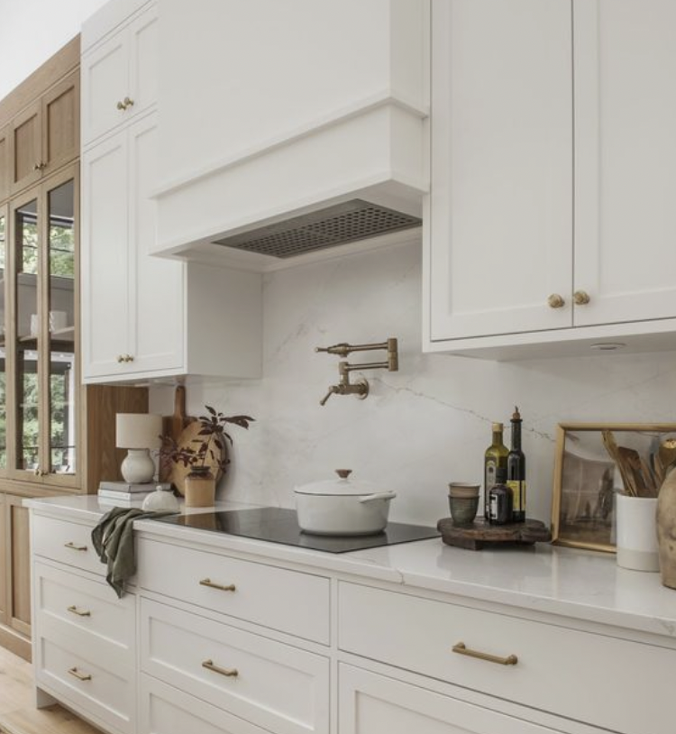
After eliminating theses options, old me probably would have done nothing (no uppers, towers, etc.) and just left all of the space open. The new mom-version of me, who values practicality and neatness to a new degree, plugged in some uppers to see how that would feel. BINGO! Below, you'll find some kitchens with upper cabinets that helped me get over my fears!
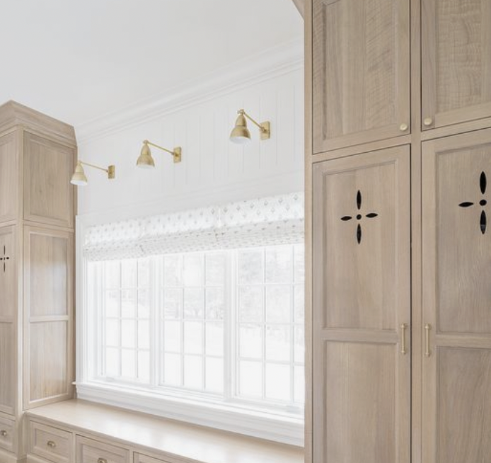
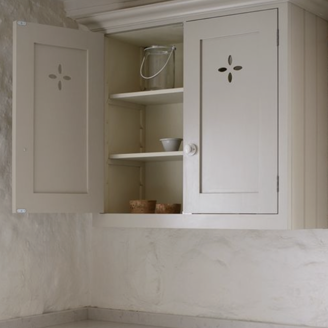
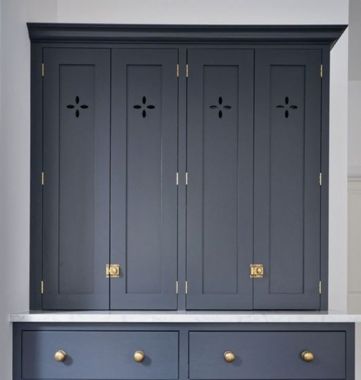
To keep the upper cabinets around the hood feeling a little more custom and little less "spec house," we are going with glass doors for the top portion (like the middle image above). Pretty bowls and cook books will add a fun element...like open shelving but less cluttered! I would also like to do some type of cut out in the doors below the glass. Ty isn't sold on this idea, but give me a few weeks! I'll share some images below of what I mean by "cut outs!" This look feels almost Moroccan, which would be a nice compliment to the zellige tile. Too, it's a nod to Alys Beach's Mediterranean vibes!
I'll do a little video tour of the kitchen space over on Instagram shortly!
Hannah


