Florida House Exterior Color
You all have been guessing about the exterior color of our Florida house! As I mentioned in this post, I had been day-dreaming of a 30a beach house for years. You better believe that I spent a lot of time in those day dreams designing said hypothetical house. I always envisioned a classic white beach house. Alas, our house with not be white! Like the Michigan build, we picked something unexpected. I think the answer may even made you chuckle, considering the Michigan build saga! That's a big hint!
Let's back up. As I mentioned, I had always envisioned a tall, narrow white house with a two story porch. In fact, below is a house that I pinned YEARS ago (like 2016!). I have had this image on a "vision board" for years....It actually looks somewhat similar to the one we are building in shape and stature! One might suggest manifestation...? More on that later. I love the look of classic white on a traditional southern beach house. Since before even buying lot, I knew I wanted white, most likely Chantilly Lace by Benjamin Moore which is my go-to. However....
Before beginning construction, we had to get HOA approval on the house plans and exterior details. This took many months. Finally, they approved everything we had selected aside from, you guessed it, our white exterior! They said that there are too many white houses going up in the neighborhood (they aren't wrong; white has become a popular color at the beach!). In addition, the particular part of the community where our house is located, called "the cottages," has additional restrictions regarding the exterior. "The cottages" consist of two rows of narrow beach houses, all pastel in color. The majority of the homes were built a couple of decades ago, so while we knew they were all pastel, we simply thought that was because of the era in which they were built (pastel was a popular beach house color in the 90's and 00's). Turns out, the pastel color palette was an HOA requirement.
The row of pastel homes is darling, I have to admit, so though disappointed (ok, at the time, devastated), I understood that the HOA wanted to preserve the neighborhood's original character and charm. I let go of my vision of a white home and started to consider other alternatives. The obvious choice would have been to go with a soft blue. Unfortunately, both houses to the right and left of us are blue. Next, I thought about selecting a beige and trying to convince the HOA design board that it was a very very soft peach, sneakily trying to get a neutral color approved. Ty was pretty skeptical that "peach-but-really-beige" would fly so we kept deliberating. We were left with pastel yellow, orange, green, pink, or purple.
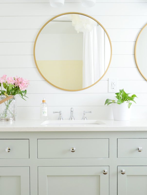
Ultimately, we selected.....GREEN! Compared to the other options, green felt the most timeless and felt most like "us." Thankfully, the HOA approved a very soft, almost neutral green. After looking all over Pinterest for a light, neutral green and analyzing dozens of paint samples, I finally landed on Sherwin Williams Contented. I will share the photo that I found on Pinterest that made me feel like, "This is the one!" This photo is of abathroom vanity by Young House Love, who ironically, knows a thing or two about pastel houses!
SW Contented is, in my opinion, the perfect green for an updated beach house. It's light and fun, yet has a neutral cast that makes it feel a little less "Spring Break" and a little more refined. Somehow, it's a green gray that isn't too cold. I was a little nervous that it wouldn't pass for a pastel due to the gray undertone. Thankfully, it passed with flying colors (no pun intended) and I am feeling real good about it!
I should add, the green will be apparent on the back of the house. From the front, however, the house will basically look white due to the two story porches (as the trim and columns will be white). In the photo below, you can see how the cottages look primarily white from the courtyard (all of the homes in the photo are actually pastel!).
We'll be accenting the soft green with brass lighting, oak furniture, and composite decking in "coconut husk" which is a nice rich mid-tone brown. These accents should do a nice job of warming up the exterior palette. The home should be painted soon...stick around for that exciting update!
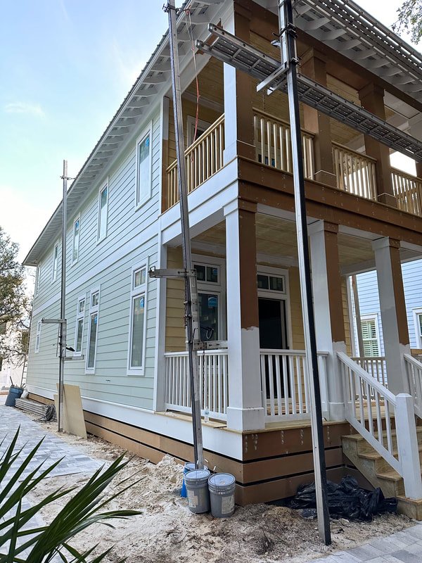
Below is a photo of the paint color, freshly applied to one side of the house! These were taken in the evening so the lighting isn't great, but it gives an idea! We saw this for the first time yesterday and are happy to report that we love it in person as much as we thought we would! Phew!
I can't help but chuckle at the fact that we are going green, again! In this post, we discussed how a green exterior was not in our original vision for our Michigan build, yet it came to be (and we love it, by the way!). White would have been playing it safe...green is a perfect fun color to make you feel like you're at the beach!
Hannah


