Florida House Floor Plan
Are you ready to see the actual house?! I still can't believe this is real! Ok, little back story on the house plan...the neighborhood is filled with custom homes, all different from one another. There are certainly themes amongst the neighborhood and HOA requirements, but in general, there is a lot of variety within the community, which is something we love about the neighborhood. I could walk the streets all day admiring the beautiful homes, each so unique.
There is one little corner of the neighborhood (where our lot is) called "the cottages." These lots and homes are smaller than the rest of the neighborhood. This area consists of skinny beach houses, all pastel in color, with a courtyard between them. It is truly homey and adorable! The skinny lots require narrow homes with a very specific footprint. The HOA provided a floor plan that was created by an architecture years ago (our lot was the very last one left that had not been built on in the 30 year old neighborhood). We were able to change the interior of the home as much as we wanted, but had to follow some requirements for the exterior and could not adjust the square footage.
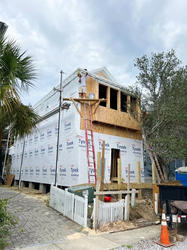
Thankfully, I love the exterior of these homes and the floor plan was already very efficient and functional. I made some minor adjustment to the exterior and some more major ones to the interior. I thought it might be fun to share the original house plan and then our adjustments so you can see how and why we made specific changes! Below you'll see the house. Note: the wood siding has not yet been painted!
First, the exterior...I adore a double porch. The front door and double porches will face the lush courtyard which is a fun alternative to facing a driveway or street. We didn't make any changes to this side of the home (though, we are considering adding screens to the bottom porch...TBD). The side of the home won't change much aside from an attached outdoor storage closet that we will be adding for beach gear, bikes, etc.
The back of the house is what we changed the most (south elevation below). The original plan had a tiny 4 foot porch off of the main floor guest room, barely enough space for one chair. We were excited that the HOA approved our plan to elongate this porch to be around 14 feet.
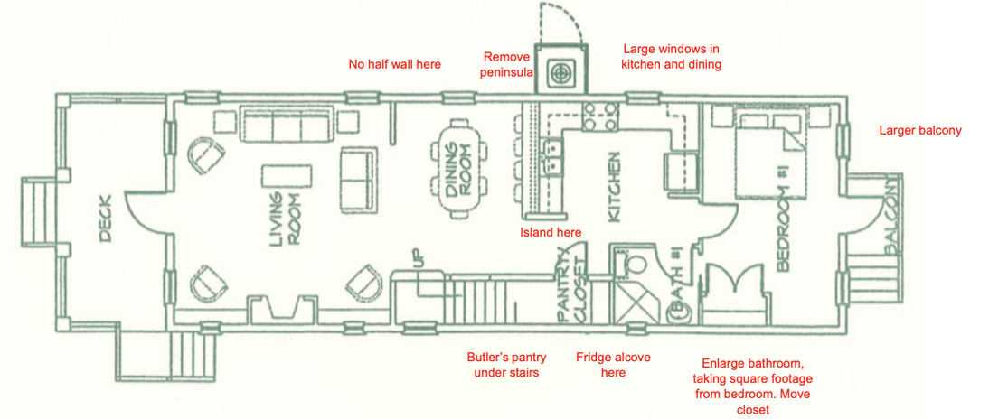
Now, it's the interior where we made some more substantial changes. I had a few issues with the main floor....the corner shower in the guest bathroom (corner showers always feel tight), the small dark kitchen, and the cabinetry layout (peninsula). We moved the wall dividing the bathroom and the guest room a few feet to enlarge the bathroom and shrink the bedroom. The bedroom still has plenty of room for a queen bed. There are two large bedrooms upstairs and bunks, so trading some bedroom square footage for a functional bathroom and kitchen was an easy choice. We elongated the guest bathroom in order to fit a full tub/shower combo instead of the small corner shower unit. This left us with a walk-in guest closet, too.
We moved the bathroom wall a few feet toward the back of the house so that we could put the fridge on that wall. This also allows us to have room for an island (which I prefer to a peninsula). The range will move to where the fridge was and the sink will move to the exterior wall, a 6' window behind it. The closet under the stairs will be converted to an adorable little butler's pantry with a slanted ceiling. I have some fun ideas for how to pack some high design into that space.
Original Floor Plan:
Revised Floor Plan:
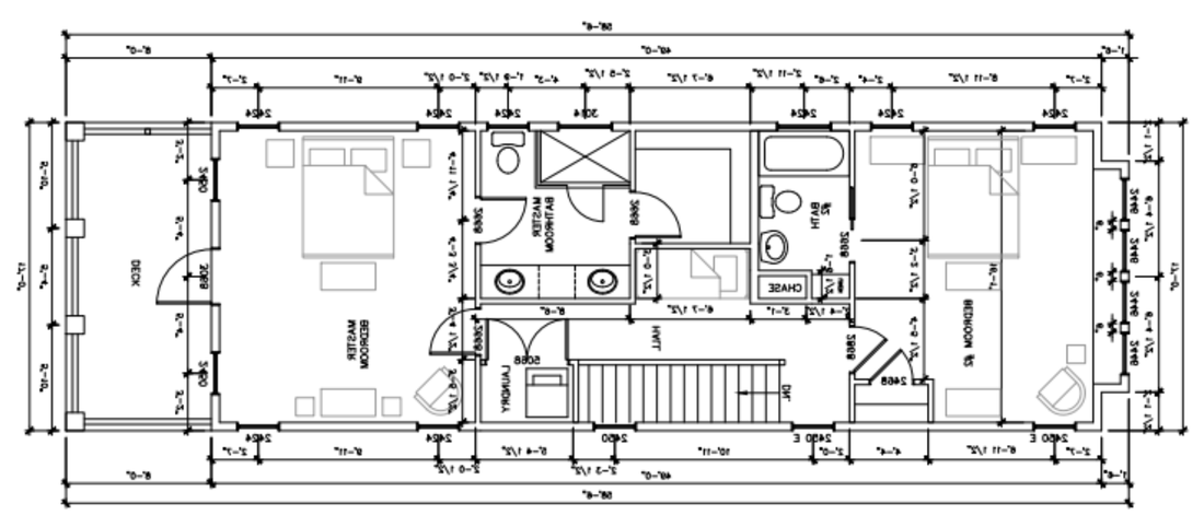
Upstairs, we made only a few adjustments. We really wanted to incorporate some built in bunks to have additional space for guests and to maximize rental rates. After analyzing the plan, it was obvious that the master closet was unnecessarily large (especially for a vacation rental!). We shrunk the master closet and took that space for built in bunks in the upstairs hallway. Built in bunks like this are very common in the area. We also swapped the location of the closet and bathroom so that you will enter the bathroom from the bedroom, then proceed to the closet. This flow feels more natural. Closets are messy, so I prefer not walk through a closet to get to the bathroom. Plus, this allows the closet to be more functional as one large space with one door, verses two bifold doors as shown in the original plan.
On the other end of the house, we added a small bedroom closet as the original plan did not have one. We could have done another full length porch off of this room but opted for a window bench that juts out instead. Being a room that our kid(s) will likely use, we didn't want a second story porch accessible. Plus, there are already three porches on the house which is plenty, and the window bench is going to be so darn cute!
Original Floor Plan:
Revised Floor Plan:
The floor plan is very efficient and does a great job of utilizing the square footage. And the best part about a narrow house? Lots of windows as every room has at least one exterior wall! We added a large window behind the kitchen sink (a staple in nearly all HTH kitchens!), a large double window in the dining room, and tripled the size of the bedroom windows. Safe to say, this house won't lack for natural light. We want to enjoy as much of that Florida sunshine as we can!
Outside the window seat in the upstairs bedroom is a Floridian oak, native of the area. It provides a beautiful view (and privacy) from the room. Each neighborhood in the 30a area has its own flavor, many of which are so curated that the plants coordinate with the overall aesthetic. This neighborhood has an abundance of palm trees and mossy oaks. We are very lucky to have this beautiful native oak on our property!
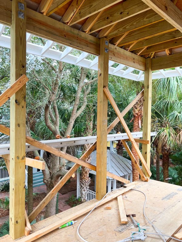
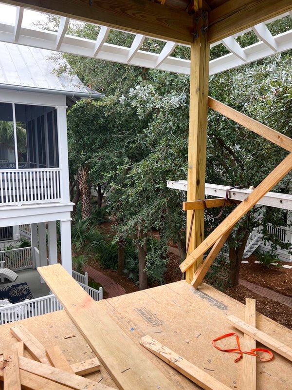
I would have to say that I am most excited for the porch off of the primary suite. I'll share some sneak peeks below. This porch overlooks the courtyard. Lush greenery not only surrounds the outdoor living space, but creates a beautiful view from inside the bedroom too. The primary bedroom almost feels like it's in a treehouse in the jungle due to the views of greenery from every direction.
We're considering a swinging daybed on one end of the porch. I can imagine cuddling up on the daybed, enjoying the ocean's breeze and the rustling noise of the palm trees. Romantic and relaxing. The other end of the porch will have a table and chairs, creating the perfect place to read, write, or work. Most likely, this will become my go-to office space! I think I could get used to answering emails and getting work done from up there!
Head to Instagram for video tours and updates to get a better feel of the flow! And soon, I'll be starting the exterior siding color! Any guesses??
Hannah


