Lakehouse Bathroom Reveal
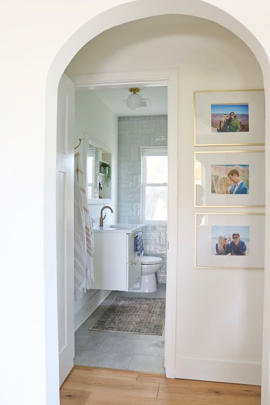
Finally, we're sharing all of the details from our bathroom renovation! This room got a COMPLETE gut! We removed the paneling, the tub, the subfloor, and even the ceiling! This bathroom is quite narrow, so we had to get creative to we add interest and make the space feel larger!
Shop this room below!
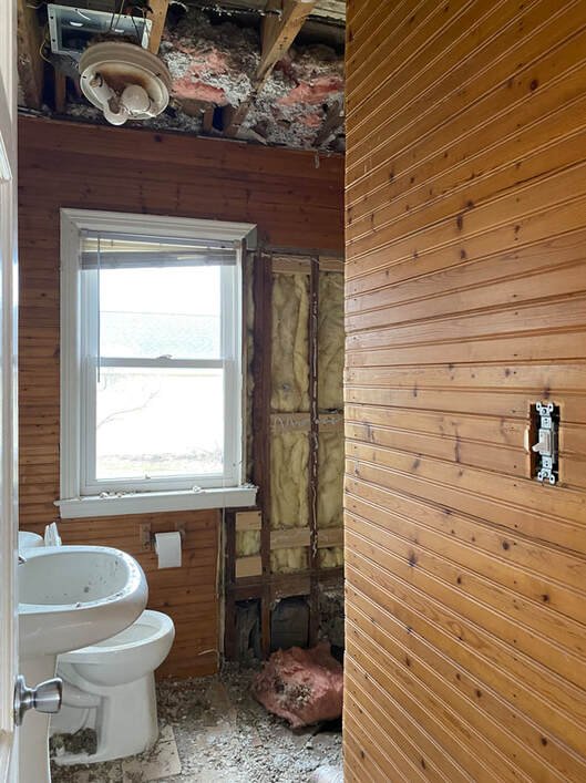
The dark bead board made the room feel small and closed in. The tile floor was not only dated, but crumbling. The pedestal sink did not offer any storage. Don't even get me started on the wood "saloon doors" framing the mirror! All in all: this bathroom was a train wreck!
Progress picture below...yikes! Hard to believe what this room once looked like! Breaking up the cast iron tub, removing the ceiling, and ripping up the original subfloor was a huge task...not to mention, messy!
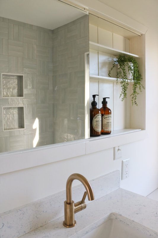
Installing tile around the entire back wall not only made the bathroom feel larger, but also added a major focal point. . The parquet tiled wall adds both intrigue and is an unexpected feature. We selectedthe most gorgeous light blue tile, which has a subtle iridescence to it. I love the pearly finish and handmade texture! (Grout color is Tec Silverado)
Due to a lack of storage in the home, we opted to keep the medicine cabinet. We ripped off the "saloon doors," framed the mirror with 2.25" trim, and installed shiplap inside. The mirror slides from one end to the other. Behind the mirror, we store things like toothpaste, hairspray, etc. I also love that it provides a place to display the soap, rather than keeping it on the vanity counter (you know I love my counters empty and clean!)
We installed 12x24 vinyl tile flooring. It's entirely waterproof and looks like actual tile; you can even feel the "grout joints!" The large format, compared to a mosaic, elongates the room. In addition, we didn't want something too busy that would compete with the parquet wall tile.
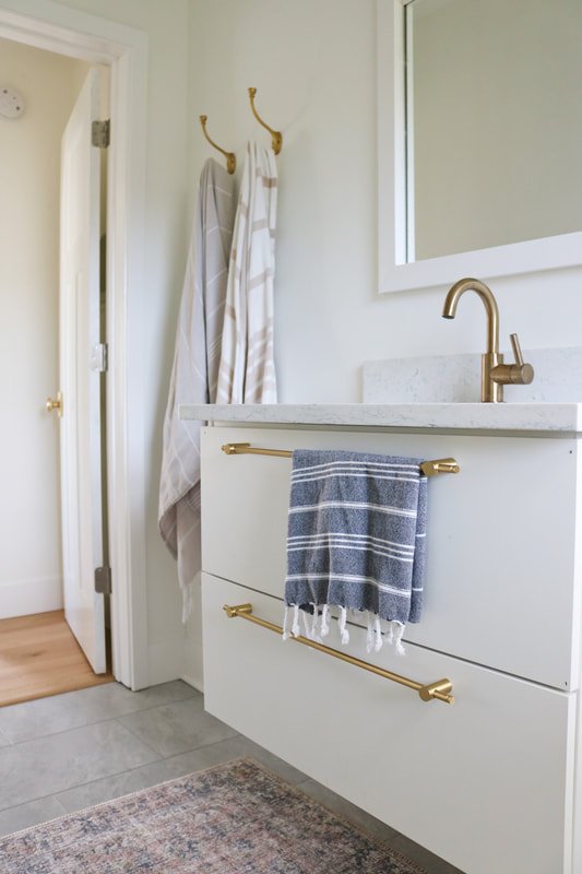
We saved a few dollars going with afloating vanity from IKEA. To spruce up the basic design, we bought a quartz remnant locally, instead of going with IKEA's prefab countertop. This quartz is called "Blue Carrara," which coordinates wonderfully with the pale, almost neutral, blue hue of the tile.
Thanks for following along! Stay tuned as we are soon to tackle another bathroom project.....we have just begun getting quotes for a master suite addition onto the back of the house!! EEEK!!!
Hannah J


