Lakeshore Build Kitchen
Ah, the kitchen, the heart of the home. By far, this is my favorite kitchen yet! It's cozy, inviting, and functional. I'm thrilled with how this space came together after months of planning and coordinating! I really wanted this kitchen to have some soul and character. While I have loved our previous kitchens, most of which were white-on-white, I was ready for something with more depth. I do think white kitchens are timeless and fresh, but I was eager to design a kitchen with more color and variation to bring some uniqueness to new construction (which can lack character!)
Layout
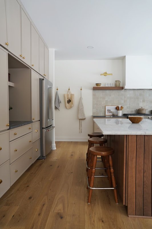
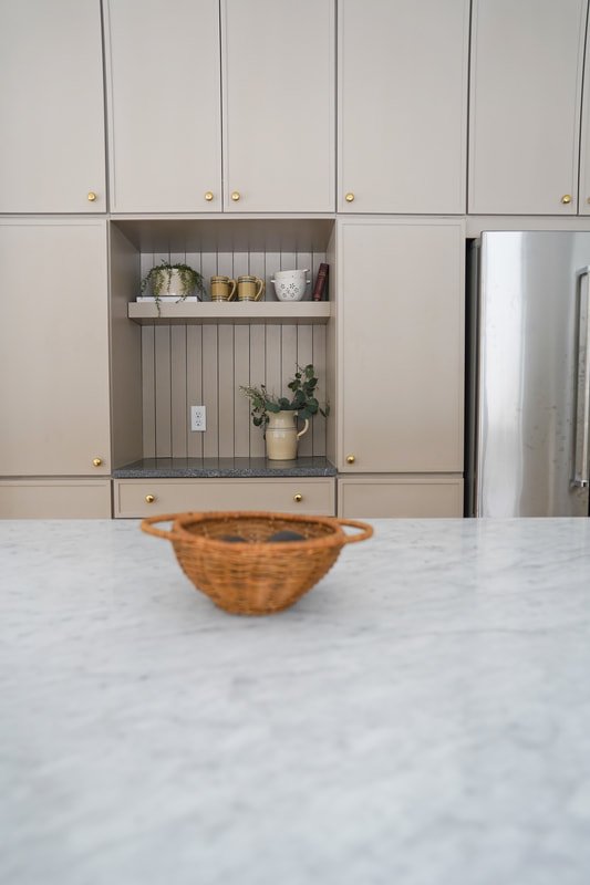
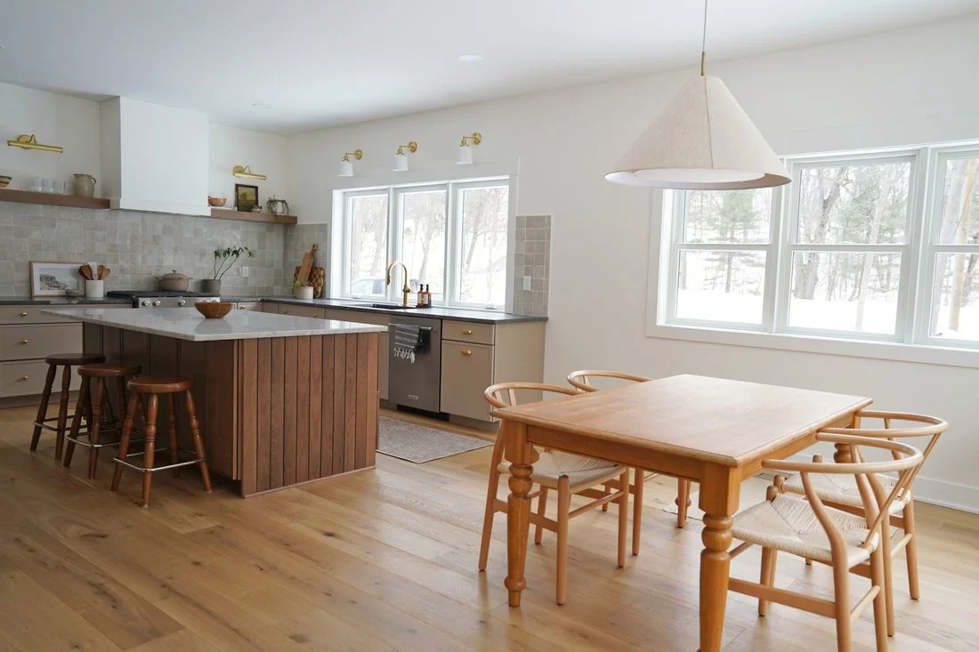
First, let's talk layout. In the original plan that I drew, the kitchen was about 20% smaller but with a pantry. The pantry was where the range is. Keeping the pantry would have pushed that wall a few feet forward, shrinking the island. Ultimately, I decided to eliminate the pantry in order to have a large spacious kitchen with a big island. To compensate for storage, we installed the large wall of floor to ceiling pantry cabinets around the fridge. Outlets inside the cabinets allow us to hide small appliances (like the Nespresso and toaster) which would typically be concealed in a pantry. We also have substantial storage in the island.
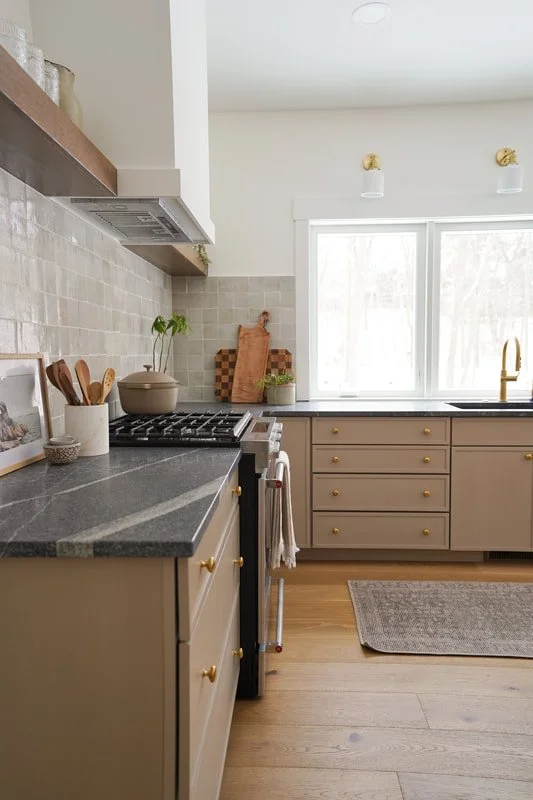
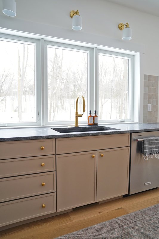
Because we drew the house plan ourselves, we were able to customize the kitchen however we wanted. Our "must haves" were a large window behind the sink, some open shelving, an island, and a coffee bar. The 9' of windows behind the sink look out to the beautiful forest. The other day, I saw deer climb up the dunes while I was doing dishes! I'd also like to note that it was important to me to not have the sink in the island. Not only do I prefer the view from a window while working in the kitchen, I also don't like the clutter that surrounds the sink to be in the center of the room. I like to keep my island clean at all times.
Shop the kitchen below:
Cabinets
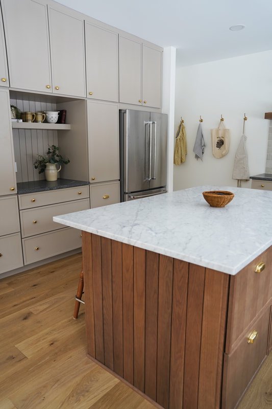
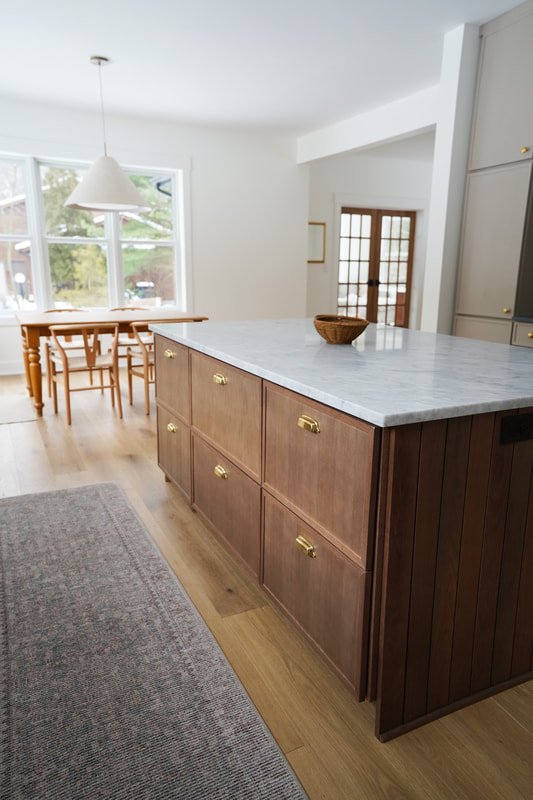
We ordered Wellborn Cabinets through local Advanced Interiors. The perimeter cabinets are in Wellborn's color Pebble which is a warm, deep beige-taupe. We opted for the Florence door which has a narrow outline around the perimeter of the cabinet, a fun alternative to shaker. The island cabinets are color River Rock which is definitely a warmer wood tone than I originally envisioned. A cooler, darker wood tone felt safer (we almost selected their color "Drift"). I'm so glad we went with the warmer River Rock as it balances all of the cool tones in the room (the white walls and Carrara counters).
I've been impressed by the quality of the cabinets! These full overlay cabinets are semi-custom. One of my favorite details is the paneling on the sides of the island which the cabinet company made for us. The paneling detail adds so much character to the kitchen, more than I had even imagined! The wood grain is gorgeous and I love the variation between each plank. This detail makes the island feel a little more like a piece of furniture than traditional cabinetry.
Similar to the island, we installed 3" paneling behind the coffee bar as well. I wanted the coffee bar (still missing coffee, ha! On the hunt for the best espresso machine...) to feel like a seamless part of the cabinetry rather than standard counter space. Utilizing cabinetry as the "backsplash" keeps the wall cohesive and makes the coffee bar feel "built in.".
Finishes
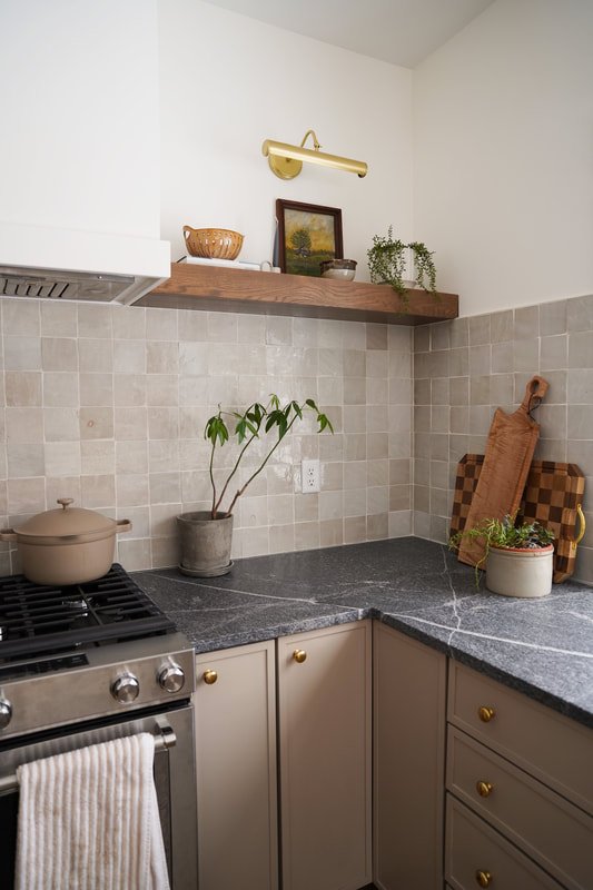
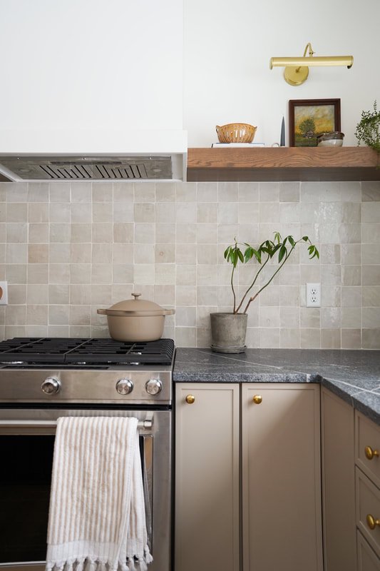
First things first, the zellige backsplash. Ah, I adore. You can read all about the zellige tile in this post. We selected color Casablanca by Zia in square. Warm tones, cool tones, and lots of variation make the backsplash a focal point. Each Moroccan tile is handmade. The imperfections in each tile are the best part!
When shopping for countertops, I had a hard time deciding whether out not to install real Carrara marble. I had always wanted real marble counters was nervous about wear and durability. There are certainly some good quartz alternatives, but there's just something about the real thing. Ultimately, I decided to compromise by installing real marble (Italian Carrara honed) on the island and a more durable material for the perimeter. This way, the areas by the sink and range (which get the most wear) are low maintenance and durable. When cooking something particularly messy, I can always use the perimeter counter space instead of the island. A few months of the living in the house and I happy to report that the island marble does not stress me out! I've come to accept that it will get some scratches and show wear over time, but I will see those imperfections as simply "life happening" and allow them to add more character to our busy family home!
The perimeter counters are granite. I perused a local stoneyard hunting for slabs and came across Silver Grey honed granite. The deep background with dramatic veining was exactly what I was looking for. The textured honed finish makes the granite look and feel like soapstone. Real soapstone requires maintenance (sealing, etc.); granite is entirely low maintenance and stain/heat resistant. I LOVE our granite tops and would absolutely install them again.
Our cabinet hardware is all unlaquered brass from House of Antique Hardware. I had originally selected these knobs and these pulls from Rejuvenation, but ordered from HOAH after reading that they were great "dupes." I crossed my fingers that the hardware I ordered would mimic the Rejuvenation pieces. Verdict? I am pleasantly surprised by the quality of the hardware! The color is perfect and the hardware is heavy and solid. I am thrilled with the product and the savings! Unlacquered brass ages and patinas over time; I can't wait to watch our hardware age and become more beautiful for years to come! We went with knobs aside from some of the drawers which have bin pulls. Mixing different hardware (knobs and pulls) is a great way to make a kitchen feel more custom.
The sconces above the window are from Etsy. The ceramic shade has a beautiful texture to it. I will add, however, that the mount on the sconces was a funky size. Our electrician said that is was not standard and it required us to do some drywall repair as the mount was smaller than the electrical rough in.
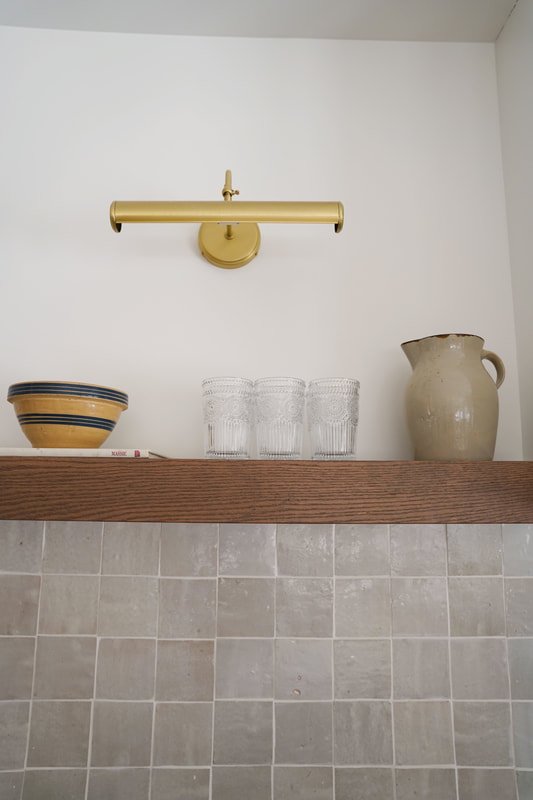
The picture lights above the shelves are from McGee and Co. I ordered them many months prior to install and waited patiently as they were backordered. Thankfully, they arrived in the knick of time and were worth the wait.
Our DuChateau hardwood floors anchor the entire space and may be my favorite element! Color Chinook is the perfect raw oak. It's warm yet organic. I love how it contrasts with the dark island yet mimics a similar richness. I will be sharing a full blog post about this stunning European oak floor!
Accessories
Most of the accessories in this kitchen were thrifted or found at antique shops! Textured pottery, an authentic oil painting, and one-of-a-kind basket invite personality and truly make the space "one-of-a-kind."
Turkish towels are a must in every kitchen.This berry bowl is adorable. I will never not have curated soaps by my sink! One of my all time favorite accessories in the kitchen is the checkered cutting board!
I look forward to sipping cold brew from these classic glasses that look great on open shelving. Last week, I hung these brass hooks, perfect for aprons and a farmers' market bag!
Next, we'll be tackling the dining space. I am designing a custom table that Ty's uncle is going to build for us! I love this table (which I thrifted!) but it's too small for the room. The new table will have a similar profile but be larger. I'll be going with oak or pine! I also have these curtains picked out and abrass rod on order. Curtains should add a lot of warm and texture to the otherwise empty dining room! This linen pendant was a last minute purchase as our original pendant arrived damaged. I actually prefer the new pendant; the shape is minimal yet the linen shade feels rich and I love the brass detail on the cord!
I also have plans to refinish the bar stools which I thrifted for $5 each! I need to sand them down, apply stain, and freshen up the metal with some rub-n-buff! There are never ending projects around here!
HJ


