New Build...Where We Saved and Where We Splurged
This is definitely my favorite type of conversation to have when I find out someone is building...where to save and where to splurge! With building, there are endless possibilities. So many options, products, new technologies. Coming up with a budget certainly helped keep me in check and forced me to prioritize what was important to us vs. what we could live without. While kitchen splurges are most common, it's always fascinating to learn what people prioritize in their homes!
5 Saves
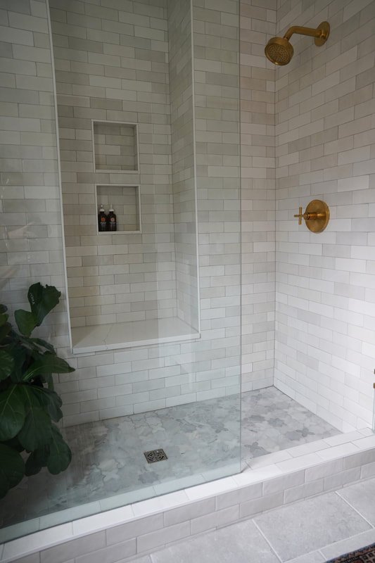
1. Primary Bathroom Shower Wall Tile
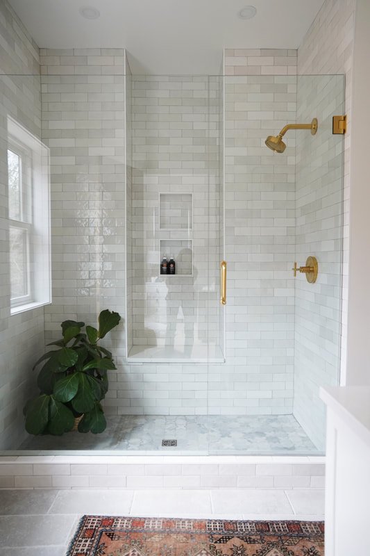
I had originally selected Zellige tile for the primary shower (similar to our kitchen backsplash). You may have read in this post that we, last minute, decided to double the size of the shower in this bathroom. To compensate for the additional labor (for tile installation), I switched from Zellige tile ($19/sf) to this ceramic alternative ($9/sf) which came out to be an approx $1000 in savings.
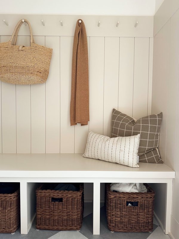
2. Back Entry Pegs Instead of Lockers/Cabinetry
Our cabinetry bill for the kitchen was running high, so we opted to eliminate cabinets in the back entry thinking that we could always add them later. We installed these simple peg rails instead. Surprisingly, we're not short on storage and likely won't be installing cabinetry in here, ever! There is plenty of storage in the adjacent coat closet. We keep coats, coolers, and shoes in there. We have baskets under the custom bench for hats, gloves, and scarves (we will swap those for beach gear in the summer). I also like that the peg rail is pretty and simple, much less heavy than bulky cabinetry. Approximately $2000 saved.
3. Garage Direction
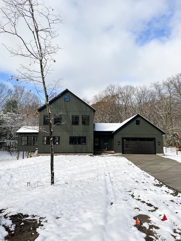
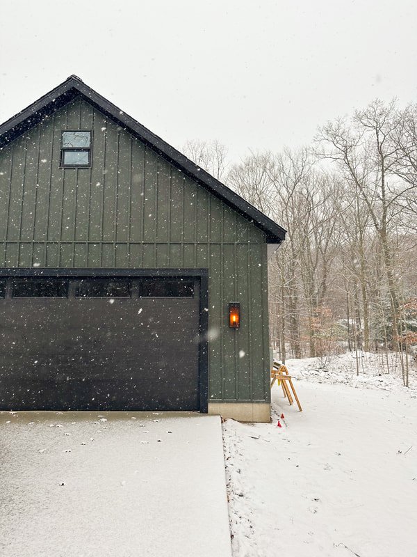
I originally drew the garage door to be on the right end of the house. The driveway would have curled around to the right of the property. Windows would have been where the garage door is now. I have never preferred the midwest "garage heavy" look. However, when our excavator was preparing the land, he informed us that we would need $20,000 more of fill and labor in order to have the driveway and garage situated that way. We decided to move the garage door to the front and simplify the driveway. Ultimately, while I do wish the garage door was more disguised, I do think the house would have looked too wide and horizontal with an incognito garage.
4. Stock Vanity in Primary Bathroom
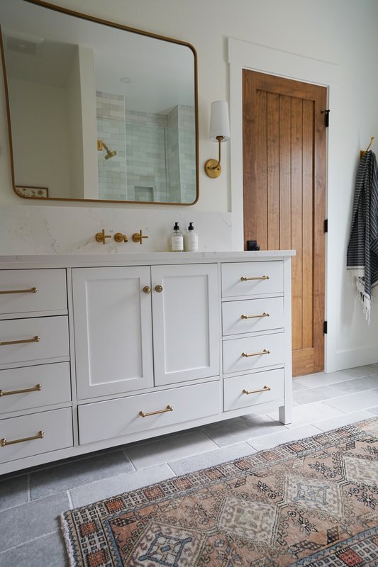
I designed a custom wood vanity for the primary bath with a local manufacturer, but the total came in upwards of $4000, I ended up ordering this $1000 vanity from Wayfair instead. To elevate the boring white piece, I swapped our the hardware and added a luxurious 10" quartz backsplash. We love it! The wood doors in the bathroom (one literally right next to the vanity) add more than enough warmth and character! In hindsight, it may have been too "wood heavy" having a wood vanity right next to the door.
5. Entry Vinyl Flooring
I was most nervous about this "save." This vinyl floor (Mannington Villa) was roughly $4/sf, compared to the $14/sf tumbled stone (+ thousands more in labor) that I wanted (what we installed on the primary bathroom floor). Verdict? It's one my FAVORITE things in the house! Definitely a follower favorite too. The harlequin pattern is fun and adds dimension to an otherwise utilitarian space! Savings roughly $7000.
Honorable mentions:
Kitchen hardware - Opted for this inexpensive unlaquered brass instead of the "it" hardware from Rejuvenation. In person, they look similar!
Front door - We saved about $2,000 going with a simple front door from Menards. I thought I would change this out in the future, but it's entirely fine and I don't see a need to change it out.
Landscaping - The house was not done in time for landscaping anyway...but we are thinking of tackling the landscaping ourselves instead of hiring it out in the Spring ($24,000 quote)
Vinyl double hung windows - While we splurged on the amount of windows in the home, we stayed with a simple profile instead of something more interesting. I regret this, though the cost to upgrade would have been substantial. As far as durability and performance, our windows are great. Aesthetically, they are bland. Though, I do like that there are no grids which keep the views of woods unencumbered.
Two stall garage instead of three - We made this change last minute and it is a total regret! We may add onto the garage!
Primary bathroom and closet size - Our primary bathroom and closet are plenty large for us, but might be considered on the small side for the caliber of the home. No regrets here, was happy to put this $ into the living room and kitchen.
Unfinished basement - Our basement in unfinished. We saved this for a future project! We will be adding a family room, bedroom, and full bathroom in time.
Single faucet in the primary shower without hose - super regret!!
5 Splurges
1. Plumbing Fixtures
These Kohler fixtures definitely felt like a splurge to us! We have always used the Delta Trinsic line in champagne brass. It's a beautiful line, but I fell in love with the Kohler purist collection and knew I wanted to install it in a future project. The fixtures are heavy duty, have a beautiful water flow (these are the things you notice when you move a lot!), and are more resistant to water spots. They steal the show in the bathrooms, in my opinion.
2. Primary Bathroom Shower Size
Our primary shower is much larger than we could ever need. We did this for resale. I moved a fig in the bathroom to give it a quick rinse and it ended up moving on in. I don't hate having room for lush greenery in a shower!
3. Amount of Windows
We didn't skimp out on the amount of windows. When I sent the drawing to my Dad (I drew the plan and we built with my Dad's help), I remember him saying, "You aren't going to have any room for furniture or artwork with all these windows!" I told him that I didn't care and I wanted it to feel like we are living outdoors surrounded by natural light! Believe it or not - I wish I would have done even more and even larger windows in several of the rooms! (living room, and bedrooms)
4. Composite Decking
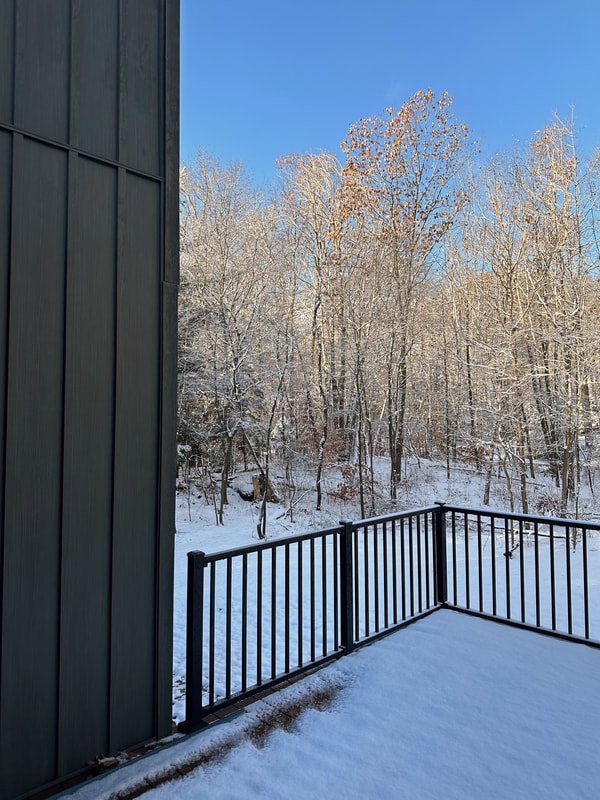
Worth the splurge every time! If there is anything we avoid while selecting finishes, it's maintenance! We installed Trex decking and vinyl railings as to eliminate any future maintenance.
5. Kitchen Drawers
Basically all of the base cabinets in our kitchen have drawers instead of doors. This upgrade cost us a few thousand bucks, but totally worth it. Drawers are far superior to doors!
Honorable Mentions
Cabinets to the ceiling - Another upgrade that is always worth it IMO
"Custom" cabinet additions - We spent a few thousand extra to add paneling to the sides of the island, install a coffee bar with matching shelf and paneling, and more.
High quality carpet and hardwood flooring - You know I am a flooring nerd! I'll always prioritize flooring. Our hardwood is top of line (I may be biased as I work for DUCHATEAU! We selected color Chinook), as is our carpet. The carpet upstairs is a high quality nylon that looks like wool. The office carpet is a high design plaid that is a nice change from boring berber!
Steel siding - We partnered with an amazing company, Quality Edge when it came to our siding selection. We LOVE our steel siding (in color "Spruce"). The installation for steel siding cost a premium compared to vinyl, but entirely worth it! I literally appreciate the siding every time I drive up to the house. And again, no maintenance, baby!
Island marble - Installing real marble on the island verses quartz ran approximately $1000 more. I'm definitely glad we went for it as real marble adds some age and depth to a new home.
Living room size - I kept enlarging the living room when drawing the plan. It's the room we utilize the most, by far!
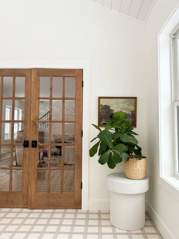
Office "addition" - We could have saved approximately $40,000 if we cut out the office/sunroom which wasn't originally a part of the floor plan.. As things kept coming in over budget, we considered it once or twice. Because we work from home regularly, we decided to keep it. It is our FAVORITE room in the house. Bar none. Definitely glad we didn't cut it!
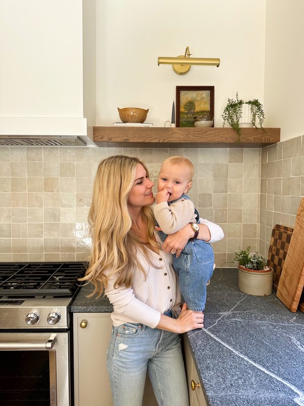
Kitchen backsplash - Zellige tile comes in at about double the cost of a ceramic look-a-like. The handmade tile adds an abundance of character!
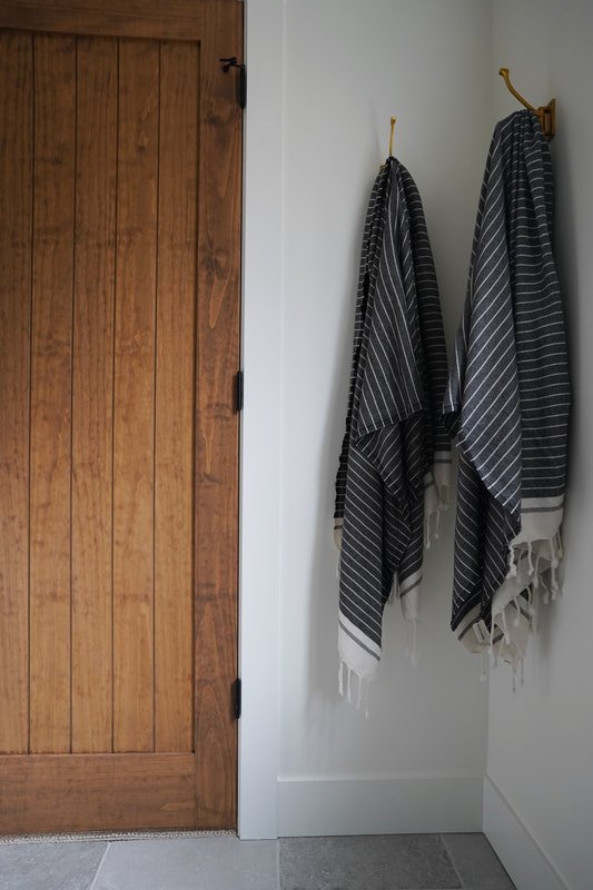
One thing that wasn't a splurge but certainly looks like it?. Our wood interior doors! The pine doors were actually more affordable that primed. The labor to vanish verses paint was more, so it ended up evening out in cost. More details on our doors coming soon!
Hannah


