WELCOME TO THE blogDesign With Us
Whether you're seeking inspiration for your next renovation project, searching for the perfect rug, or simply looking to elevate your living space, you've come to the right place.
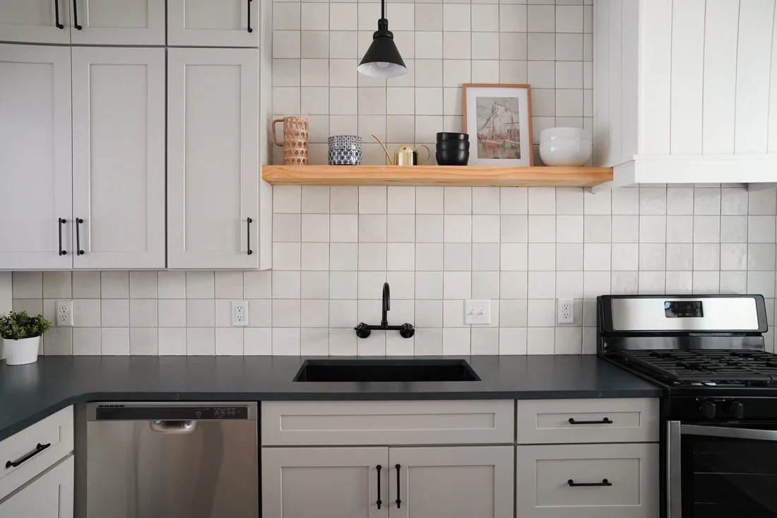
Michigan New Build Kitchen Design
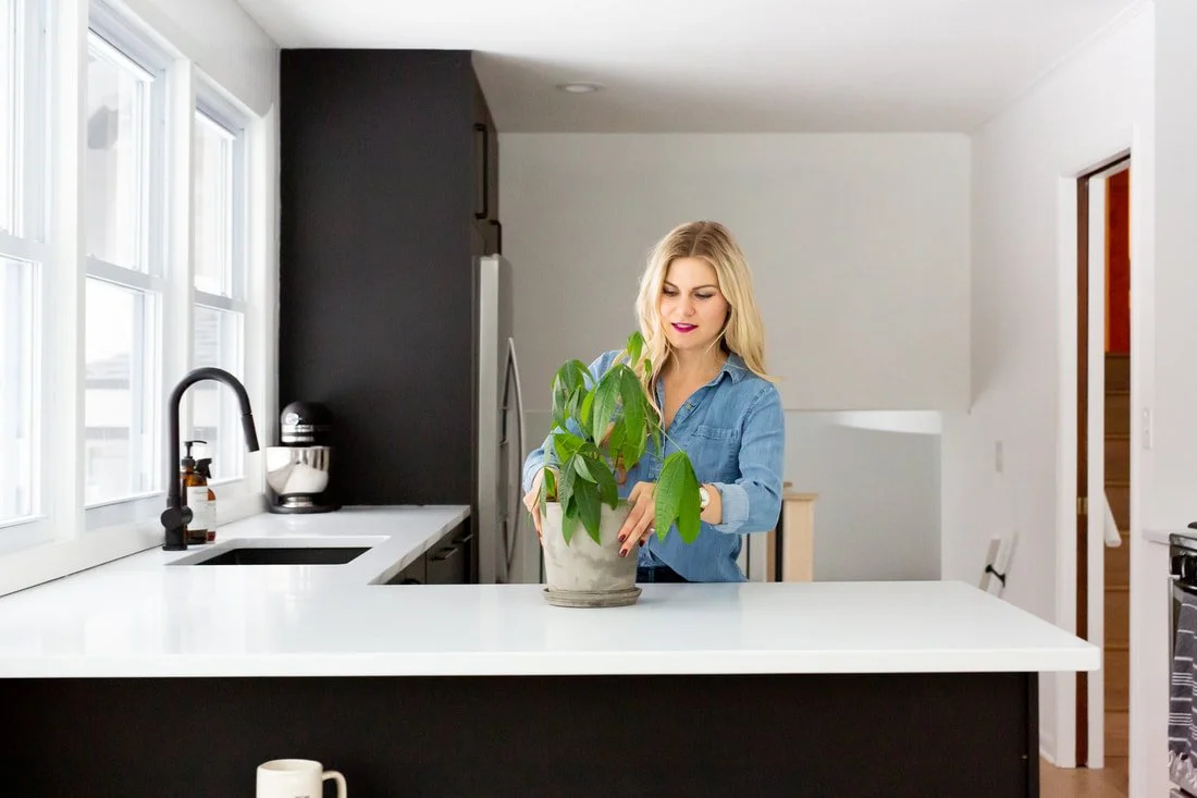
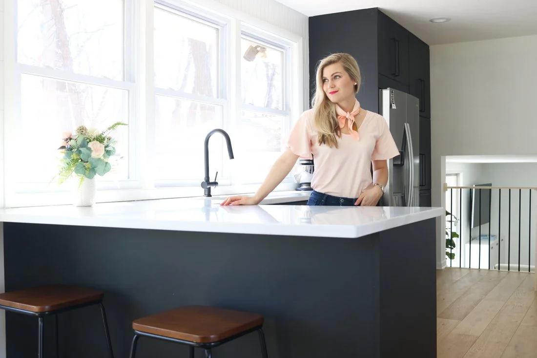
Alas! The kitchen design! I have put many, many hours into thinking of every single detail...from materials, to layout, to storage (but as always, there are so many specifics yet to iron out!). I want this kitchen to stand the test of time! As our lives grow busier, we are also prioritizing practicality and putting concerted thought behind how the space will function. I literally cannot wait to organize each cabinet. Our current kitchen is a little tight; we have bottles and sippy cups bursting out of each drawer. You better believe we are looking forward to having a designated space for each and every item!
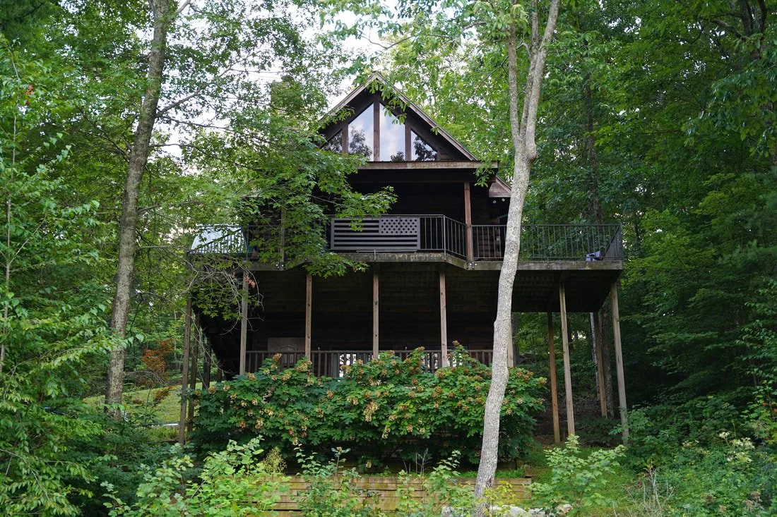
Fully Furnished Cabin Tour!
We drove down to Georgia to decorate this cabin in a period of about ten days....and what a crazy ten days it was! At just under 2,400 square feet, and with 4 bedrooms, 3.5 baths, the process of getting the cabin entirely outfitted in such a short time was no easy task (and with all of the furniture delays, no less). Thankfully, we had some help from family who drove down and to unload the moving truck, build furniture, and all sorts of things. At 6 months pregnant, I was so grateful to have some extra hands!
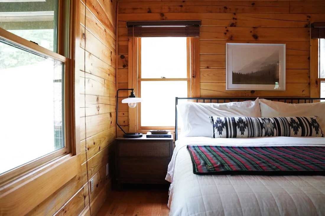
Cabin Main Floor Primary Bedroom Reveal
The first cabin room reveal is here!! We are starting with one of the coziest rooms in the house, the main floor primary bedroom. In the short time we have been at the cabin, this room has already welcome a few guests including my brother, parents, and some friends, all who came to help put this place together. Having ample room to host was such a joy. Our guests loved this space, and we think you will, too! We went with a whimsical camp theme and had so much adorning this space with both old and new pieces.
Rosewood Flip - Before & Afters, with Sources!
SOLD! It's hard to believe that this project is finished! This home, located in East Grand Rapids, had a lot of original charm but needed a complete overhaul. We designed the house striving to embrace the original era of the home, all the while modernizing it and bringing it up to date. This project took about 6 months to complete from purchase to sale. We worked with partners on this home and had an absolute blast. Read more about that here! We were grateful to have accepted an over asking offer, and can't wait for the new family who is going to call this place home!
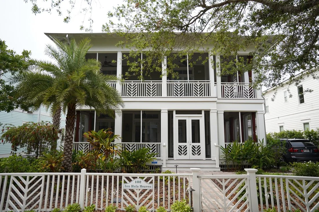
30A Beach House Project - Full Reveal with Sources!
How does one decorate and furnish an entire beach house in only a week? And maybe more challenging...how to fit it all into one blog post!? This project was a literal whirlwind! Long story short (seriously - there's a long, crazy story of how our close friends happened upon this house. It all started 10 years ago when my husband met this couple at a clothing store in Seaside, FL. Then 2 months ago, the four of us spent a weekend visiting this neighborhood...a bunch of other crazy circumstances, and we found ourselves "speed-decorating" this house just a few weeks later. We will have to share the whole story in a podcast!). Keith and Jen, our close friends, closed on this home one day before we arrived in Florida (30a area). From purchase to closing, we spent hours creating design boards for each room, sourcing furniture online, and sending links via text/email everyday. We had just over one week to get this place ready for Airbnb renters. We shipped as much as we could, scheduling delivery the week after closing. We spent the first weekend designing, planning, shopping, managing deliveries, and gathering furniture and decor. We filled the SUV to the brim MANY times (see photos below) to and from Target, World Market, Michaels, Hobby Lobby, and local shops. Painters arrived and painted the entire home Mon-Thurs. The following weekend, we built furniture, mounted TVs, hung artwork, and accessorized every nook and cranny of this beautiful Floridian home.
DIY Floating Kitchen Shelf
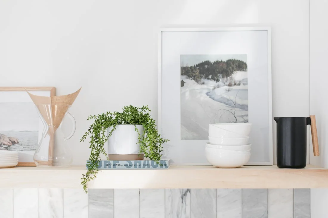
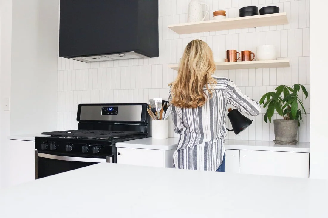
This post is long overdue! We have an affinity for shelving, and have incorporated shelving in each of our 5 kitchens. Shelving adds character to a kitchen and offers a space to display pretty dishes, plants, and even artwork! It's one way to make a kitchen feel personal. We're excited to finally share all about our kitchen floating shelf DIY...including our first ever tutorial video! We built this shelf for $77 and could not be happier with it.
Lakehouse Bathroom Reveal
Finally, we're sharing all of the details from our bathroom renovation! This room got a COMPLETE gut! We removed the paneling, the tub, the subfloor, and even the ceiling! This bathroom is quite narrow, so we had to get creative to we add interest and make the space feel larger!
Lake House Guest Bedroom
Yesterday, we shared the completed bunk room, which is adjacent to the upstairs guest bedroom. Originally, this was going to be our office. Long story short, we decided to put our office in the bunk room as we'd rather work in the room facing the lake! Last minute, we threw a queen bed into this room and it became another space for guests. The queen bed fits perfectly, and we love having a separate space that sleep 4 (perfect for family and friends with little kiddos!). Our home's bed per square foot ratio is pretty sweet. Currently, we have two queens, two twins, and one king in this little abode, ha! That's a lot of beds for a family of two; but remember, we are designing this space as a cottage!
Lake House Bunk Room Reveal
When we bought this house, Ty referred to the second floor as "Paul Bunyan's cabin in the woods." Knotty pine paneling and dark wood flooring made this space feel cramped and dreary. We knew that there was a fun, whimsical space hiding beneath the old pine! The scariest space in the house soon became our favorite. When we moved into the house, we slept up here for a few days (our queen mattress had not yet been delivered). Yes, we slept in the little twin bunks (Ty and his 6'2" stature managed to fit!). Those first few nights were memorable as we stayed up playing Scrabble and chatting late into the night. Something about the slanted ceilings and built in bunks made us feel like we were at summer camp!
Lake House Front Door Makeover!
Remember when we said we were going to wait to tackle the exterior until early fall? HA! We have no chill. When our carpenter was installing the interior doors, he asked if we wanted him to install a new front door....that turned into new siding, new light fixture, new windows, and soon, a new, extended front porch and railing. Project creep at its finest.
Lakehouse Bedroom Reveal
FIRST LAKEHOUSE BLOG POST IS HERE!! We bought this house around Christmas and began renovating in February. It's been mad chaos since. FINALLY, it time to slow down and enjoy our new home as we tackle the final details. Five months of being covered in paint and sawdust every evening and weekend, and we are thrilled to be nearing the finish line. We are also excited to have the time to share ALL the renovation details with you all on the blog! First #HTlakehouse blog post (of many), commence!
GR Condo Full Tour
We are adding these before and afters to the "Home Tour" tab above! This minimalist living adventure has taught us so much, mainly, how little we truly need to live happily. We have thoroughly enjoyed this simple living excursion. Cleaning is quick, and simple; and we have little to no clutter! For links to sources in each of our homes, head to the "Shop our Home" tab!
GR Condo Kitchen Reveal
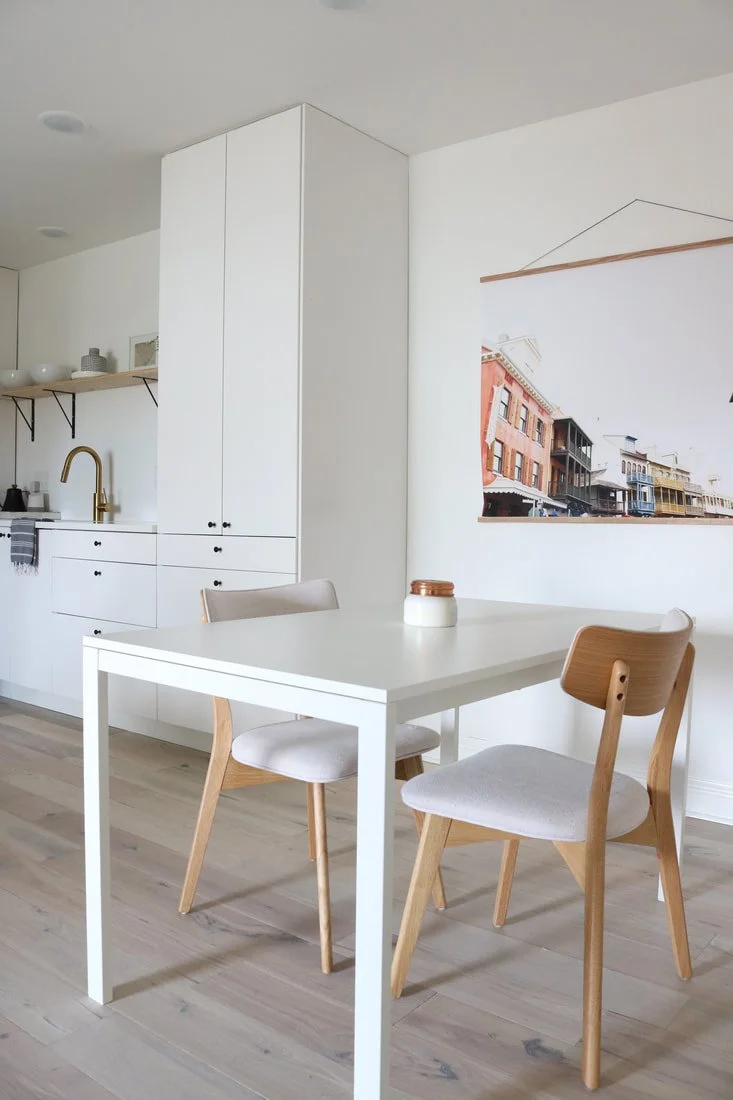
Before we move to the lakehouse, we want to share the full reveal of the GR condo renovation! For those of you who were not around when we bought this place, the full story is in this post. Long story short, we sold our mid century haven in the woods (1800 square feet on an acre in the suburbs) for 730 square feet near the city! We've truly grown to the love the simple life that this condo promotes. Rather than spending our weekends maintaining a large backyard or cleaning multiple bathrooms, we are spending more time outside, pursuing creative outlets, and investing in relationships. We have also LOVED being a short drive from our favorite walking path, local restaurants, and coffee shops.
Lakehouse Design/“Theme”
Throughout the years, you've asked for more insight on the design process...and we've listened! So, going forward, I am going to begin sharing more of how we design our spaces. The first decision we ultimately make is what "theme" suits the home. Typically, factors that help us select a theme are existing features of the home, location, and original architecture. Next, we consider personality. If we were helping a client design a home, I would try to nail down their personal preferences and lifestyle so that I could design a space that reflects them. For example, for our residences, this translates to minimal decor and clean spaces.
All About the Frame TV!
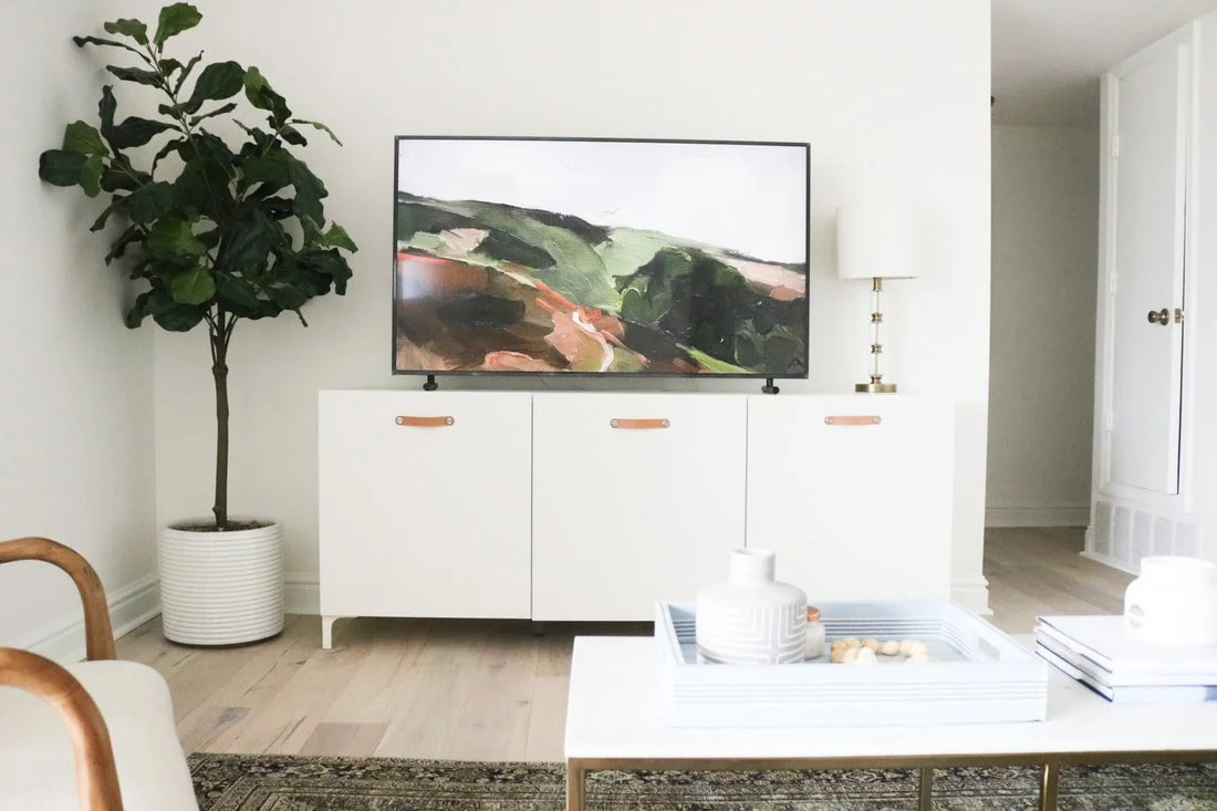
We are so excited to talk to you guys about this TV! I have not gotten excited about a new piece of "technology' in years...okay, ever. Our living room TV had been lagging a bit. This did not fly with Ty on college football Saturdays. Being a kind wife, I encouraged Ty to research TV's...specifically the Frame TV, which I had heard several bloggers mention prior. (Ty, who had never heard me "encourage" him to look for a new TV, realized that this gift was as much for me as it was for him!) The Frame is much more than a TV...it's also artwork!
Homeslice Midwest Feature
Ty and I are honored to be featured in Homeslice Midwest's website launch! Nicole at HSM created the site in order to connect interiors enthusiasts around the Midwest. Her unique platform cultivates inspiration through sharing home tours and design resources. Our minimal mid-century Ada home tour is live on HSM. Ty and I, as we recently sold the Ada house, loved seeing these images of our home, and even more, loved reading Nicole's depiction of our philosophy. She truly grasped the essence of who we are, and how minimalism and travel play into our design process. Read the full feature here complete with more images, follow Homeslice Midwest on Instagram, and tag your #HSMnest!
Tips for Ordering and Installing an IKEA Kitchen
We love our IKEA KUNSBACKA cabinets. Read all about our full review of IKEA cabinets in this post, where I detail all of the pros and cons of going with IKEA for your next kitchen. We were entirely skeptical, but I couldn't find the right matte black cabinet front elsewhere (at the right price), so we decided to give IKEA a try. We learned a lot doing our first kitchen with IKEA. Next time, we will be more efficient since we have done it once before. Today, I'm sharing our experience, along with some tips for ordering IKEA cabinets!
IKEA Vanity Hack
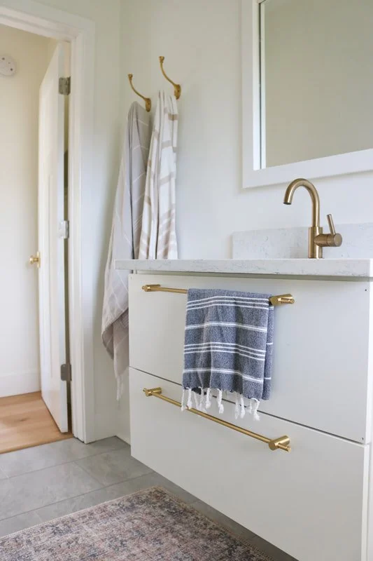
Floating vanities allow for a continuous floor, making a bathroom feel larger. When designing our bathroom renovations, I fell for IKEA's floating vanities. They are available in a myriad of colors, including a gorgeous light oak. Beyond a well rounded collection, you can't beat the PRICE! Although, we had to get creative when installing the under-mount sinks.
Our DIY Wrapped Exhaust Hood
We are so happy with our wrapped exhaust hood! It is minimal, yet dramatic. We love that it is versatile - we could paint it any color, tile it, or wrap it in wood! We are enjoyed the matte black for now, but may install a tile like this when we are ready for a change! Our followers are often asking what material we used for our hood. It's just drywall! Today, we are sharing how we designed and created this piece.


